
Accessibility
Every row on the Accessibility screen (control type, range, and default) for vision, motion, the settings app, screen reader, and touch.
The Accessibility screen collects every vision, motion, screen-reader, and touch accommodation WM Keyboard offers in one place, grouped exactly as they appear on screen. This page is the field reference. For the reasoning behind each option, read Accessibility overview instead.
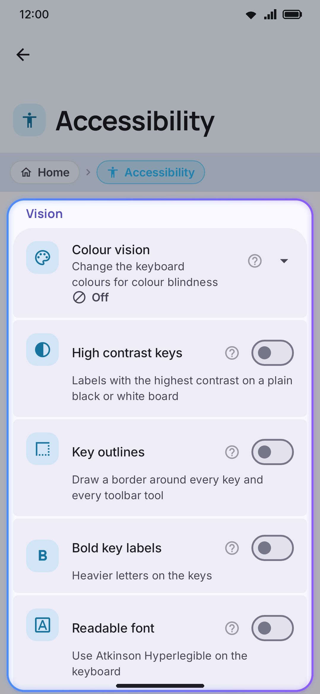
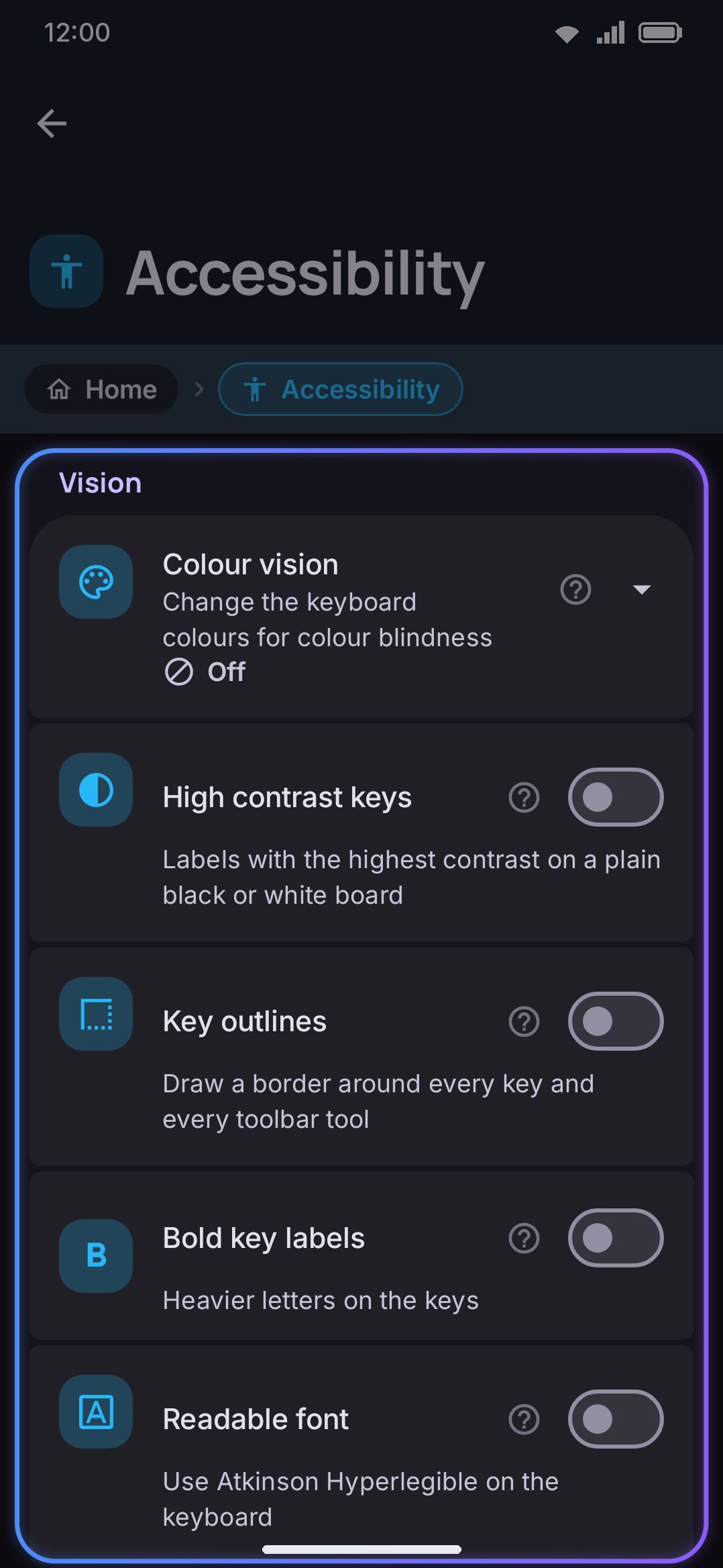
Options
Section titled “Options”Vision
Section titled “Vision”| Setting | Control | Options / range | Default |
|---|---|---|---|
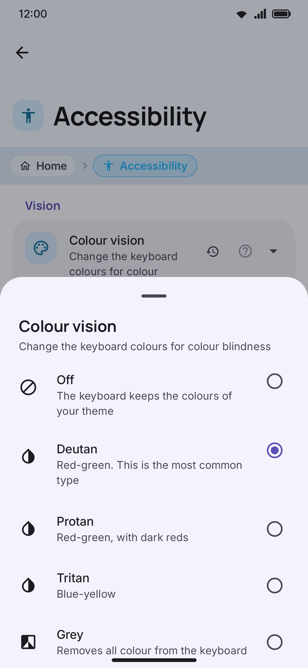
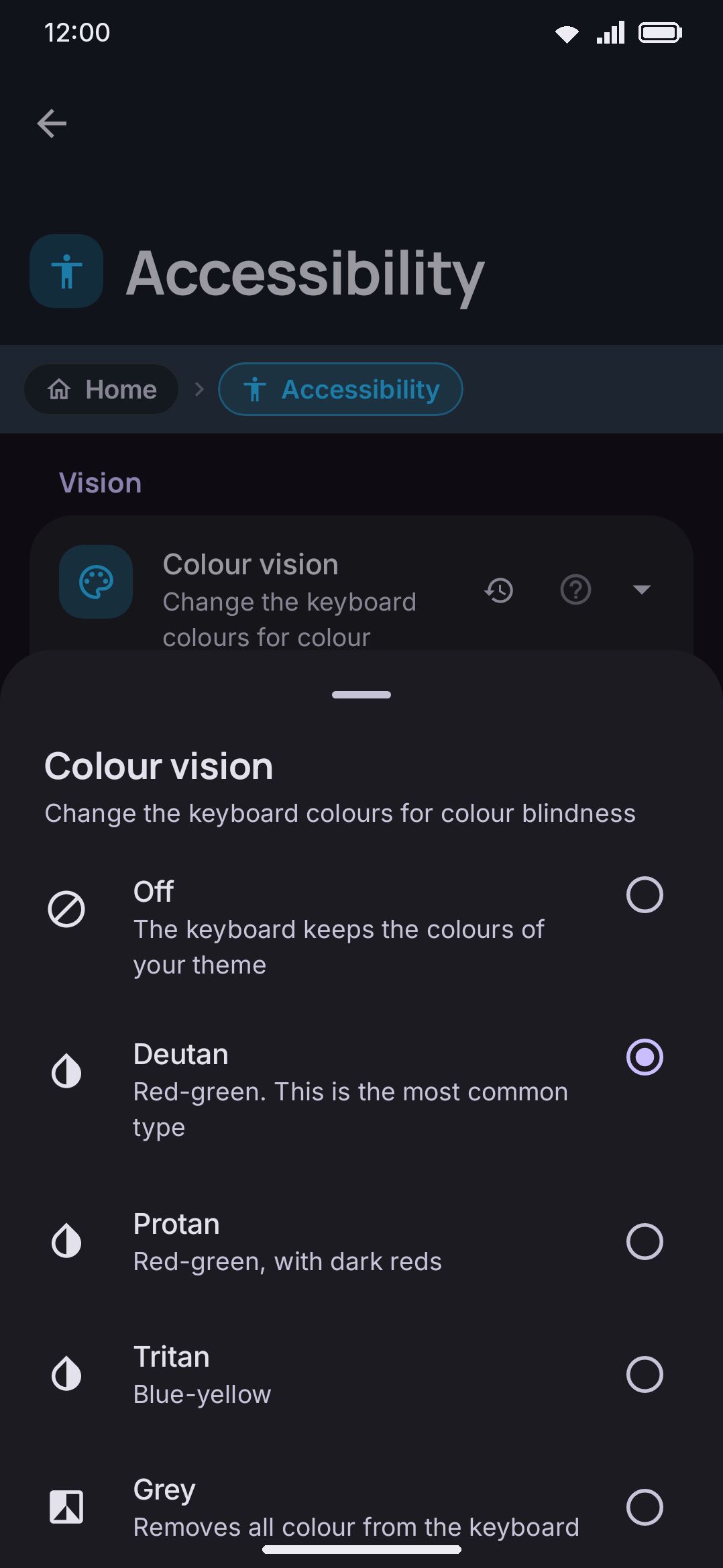
| Colour vision | Choice | Off / Deutan / Protan / Tritan / Grey | Off |
| High contrast keys | Toggle | On / Off | Off |
| Key outlines | Toggle | On / Off | Off |
| Bold key labels | Toggle | On / Off | Off |
| Readable font | Toggle | On / Off | Off |
| Text size | Opens Appearance, showing the current value | n/a | n/a |
| Keyboard font | Opens Keyboard font | n/a | n/a |
Colour vision applies a real-time correction for red-green (Deutan, Protan) and blue-yellow (Tritan) colour blindness, or strips colour entirely (Grey). It corrects the keyboard’s own palette rather than simulating what a colour-blind person sees.
High contrast keys flattens the active theme to a plain black-or-white board with maximum-contrast labels, but keeps the theme’s accent colour, so Shift and an active toolbar tool still stand out.
Readable font is a derived toggle rather than its own stored setting. It reads as on only when the keyboard’s font is already Atkinson Hyperlegible. Switching it writes straight to the same font setting Keyboard font below uses, and that Fonts under Appearance uses. There’s no separate default to track. It starts off because the keyboard’s font starts at its system default.
Text size shows the key label size and opens Appearance, where the slider lives (70% up to 200% of normal). To change the size of the keys themselves, use Size, position & one-handed use. The two are easy to confuse, and they live on different screens.
Motion
Section titled “Motion”| Setting | Control | Options / range | Default |
|---|---|---|---|
| Reduce motion | Toggle | On / Off | Off |
Reduce motion turns off non-essential animation across the toolbar, animated theme backgrounds, and this settings app’s own transitions. Feedback that tells you something stays: the key-preview bubble, the pressed-key colour, the glide-typing trail. Removing those would make typing harder rather than easier.
Power saving mode can flip this same behaviour on as a side effect of its own “Animations” toggle, without touching this switch. Check there too if animation is off and you didn’t turn it off here.
Settings app
Section titled “Settings app”| Setting | Control | Options / range | Default |
|---|---|---|---|
| Icons in settings | Toggle | On / Off | On |
| Screen transitions | Toggle | On / Off | On |
Icons in settings draws the coloured icon beside every setting, including the theme editor’s colours and sliders and the layout editor’s rows, on the home list, beside search results and in each screen’s heading. Lists of your own languages, layouts, words and packs have no icons. Turn it off for plain rows with words only, the way the settings looked in earlier versions. The icons on the screen you are on shrink away as the words slide over; with Reduce motion on they go at once.
It affects this settings app only. The keyboard and its toolbar keep their icons, and so do lists whose icon is the content: the Tools list, a tool’s own page heading, addons and modes.
Screen transitions moves a row’s icon and name into the heading of the screen it opens. Turn it off if settings screens stutter on your phone: the screens then open with the plain sideways slide and skip a second layout pass, because the layer that runs those transitions lays everything out twice even when nothing is moving. Reduce motion turns these transitions off too, and so does the two-pane layout on a wide screen.
Screen reader
Section titled “Screen reader”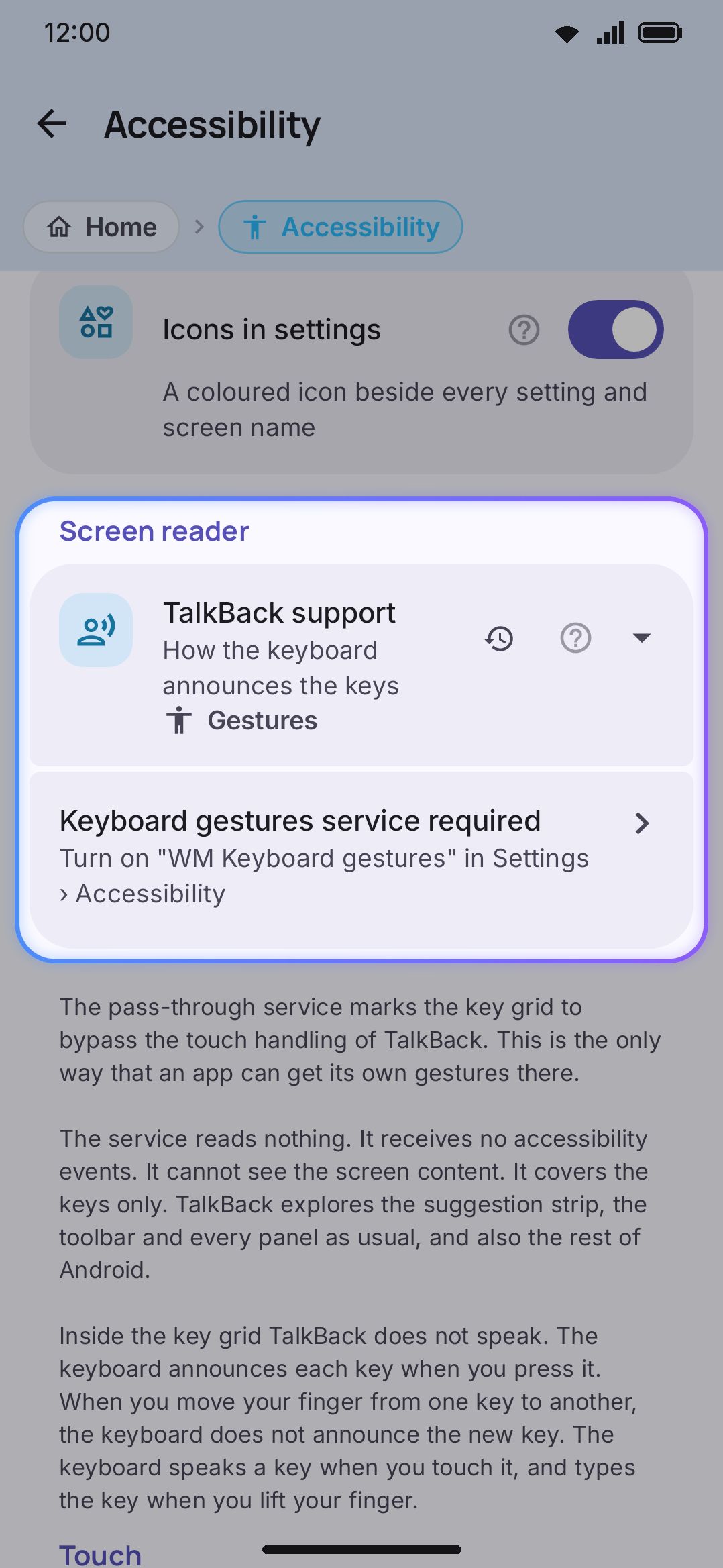
| Setting | Control | Options / range | Default |
|---|---|---|---|
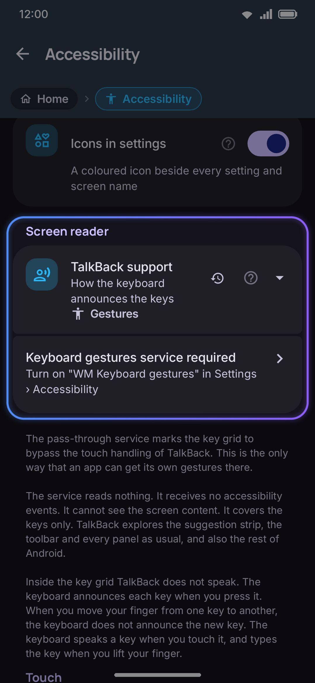
| TalkBack support | Choice | Off / Labels / Explore / Gestures | Explore |
| Keyboard gestures service (shown only when TalkBack support is Gestures) | Opens system Accessibility settings | n/a | n/a |
Setting TalkBack support to Gestures reveals the Keyboard gestures service row. Its title and subtitle change with the system service’s grant state, re-checked automatically when you return to this screen from Android’s own Accessibility settings:
| Grant state | Title | Subtitle |
|---|---|---|
| Not granted | “Keyboard gestures service required” | Turn on "WM Keyboard gestures" in Settings › Accessibility |
| Granted | “Keyboard gestures service” | “On. The keys get your touches. TalkBack keeps the rest of the screen” |
Tap the row and a disclosure appears first, explaining what the service reads (nothing) and what it does. Continue from there and the app opens Android’s Accessibility settings. Without the service granted, Gestures mode falls back to behaving like Explore.
WM KeyboardAccessibilityTouch| Setting | Control | Options / range | Default |
|---|---|---|---|
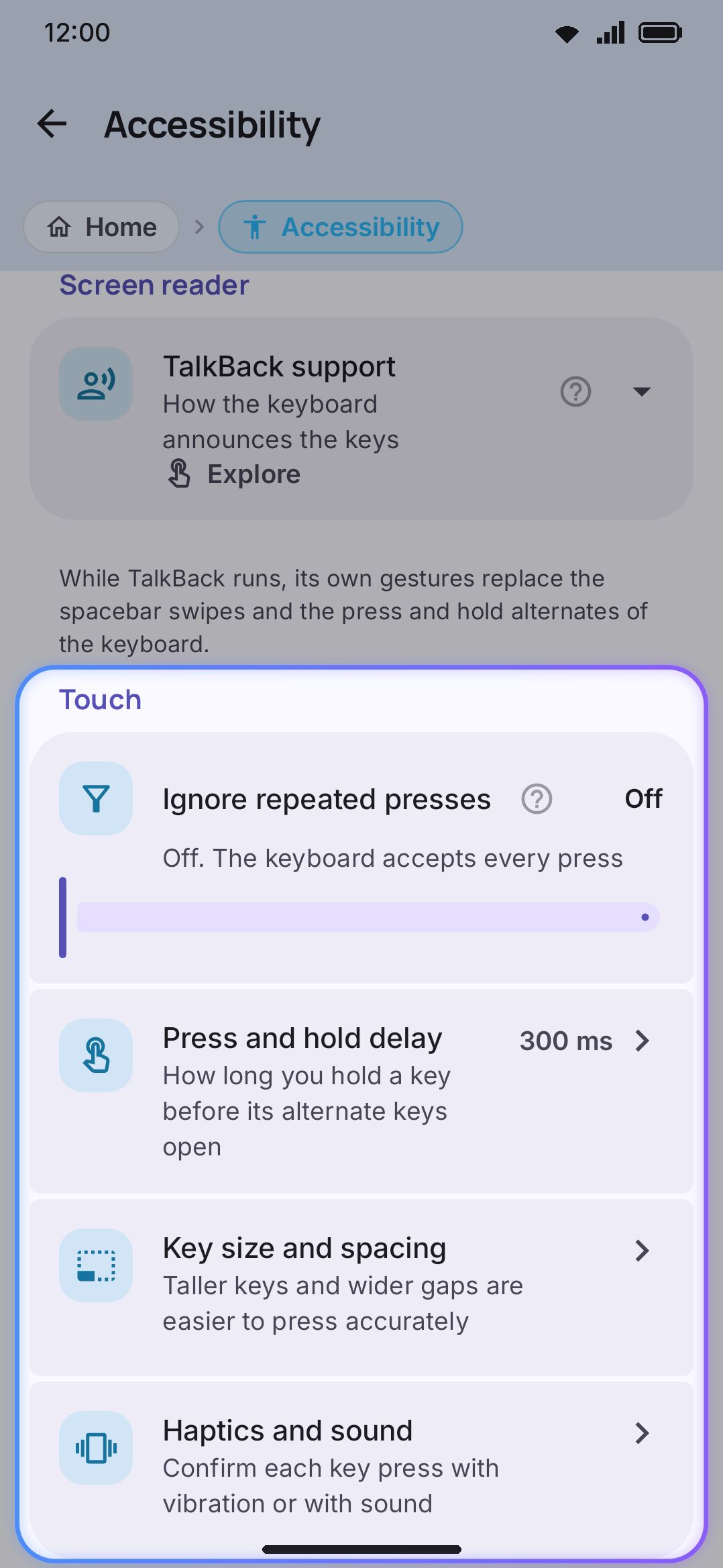
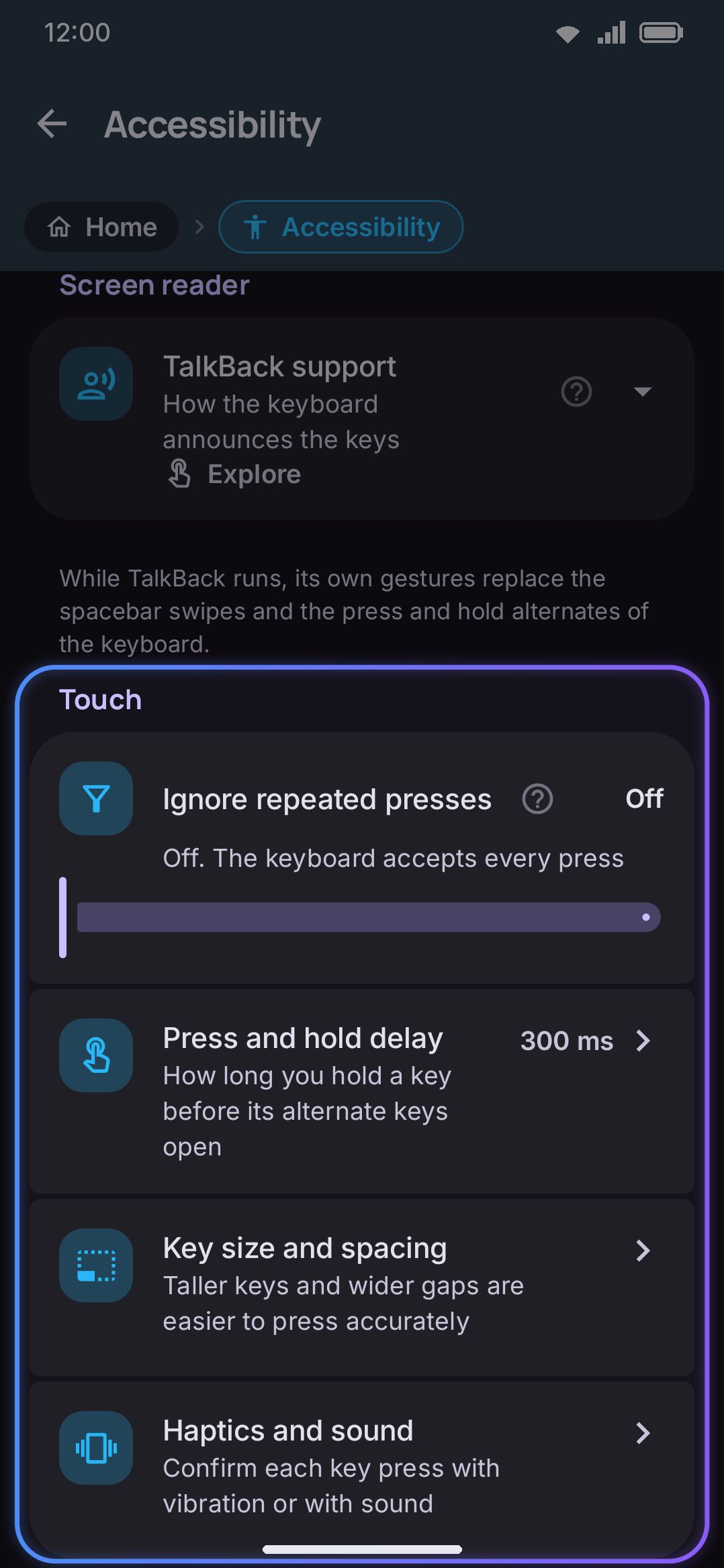
| Ignore repeated presses | Slider | 0–500 ms | Off (0 ms) |
| Press and hold delay | Opens Key press, showing the current value | n/a | n/a |
| Key size & spacing | Opens Layout & size | n/a | n/a |
| Haptics & sound | Opens Key press | n/a | n/a |
Ignore repeated presses is the on-screen name for what the overview guide calls debouncing. The word “debounce” itself never appears in the app. It discards a second press of the same key that lands within the chosen window after the first. Two different keys pressed close together are never affected.
Key size & spacing and Haptics & sound are plain navigation rows, not settings stored on this screen. They open Layout & size and Key press respectively.
Details & edge cases
Section titled “Details & edge cases”- Screen reader default is Explore, not Off. See the note above. This is the one default on this screen most likely to surprise you.
- Readable font has no independent default value. It mirrors whichever font
keyFontIdcurrently points to, so there’s nothing to reset separately from the font itself. - The on-screen label for the greyscale colour-vision filter reads “Grey.” The setting’s internal name is
GRAYSCALE, but nothing you see in the app spells it that way. - Text size here and the key-preview popup’s font scale are two different settings. Both scale text, but changing one doesn’t change the other.
- Ignore repeated presses only filters a repeat of the same key. It cannot slow down typing in general by blocking different keys pressed close together.
- The gesture pass-through service needs Android 11 (API 30). WM Keyboard’s minimum supported version is Android 7.0 (API 24). Anywhere from Android 7 through Android 10 you can still grant the “WM Keyboard gestures” service, but the system call it depends on is unavailable, so the service does nothing. Gestures mode quietly behaves like Explore even with the service on.
- Icons in settings and Screen transitions are settings-app preferences, not keyboard ones. Nothing you see while typing changes with them.
- No edition differences. Every setting on this screen, and the pass-through service behind it, works the same on both the full and lite builds.
Related pages
Section titled “Related pages”- Accessibility overview: the why behind every option here, plus one-handed and floating-keyboard accommodations that live on the Layout & size screen instead.
- Fonts: the full font browser the Keyboard font row opens into. Readable font is a toggle, not a navigation row, and it writes the same setting without opening anything.
- Size, position & one-handed use: for making the keys themselves bigger, not just their labels.
- Sound & vibration: the destination of the Haptics & sound row.
- Power saving mode: another path to reduced motion, independent of the toggle on this screen.