Icon packs
Replace toolbar and key icons one at a time, or all at once by installing an icon pack.
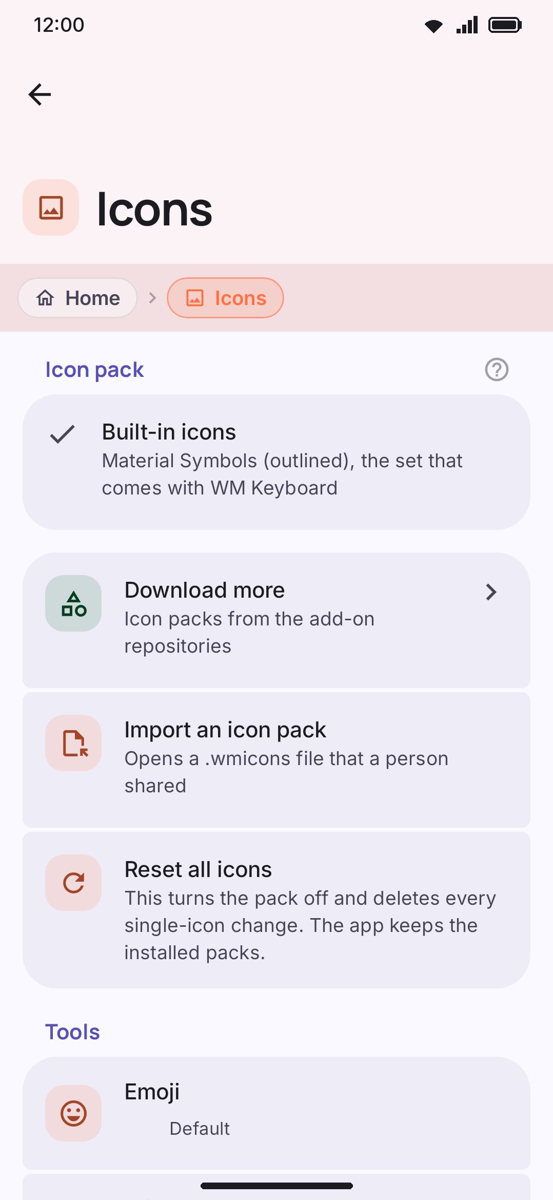
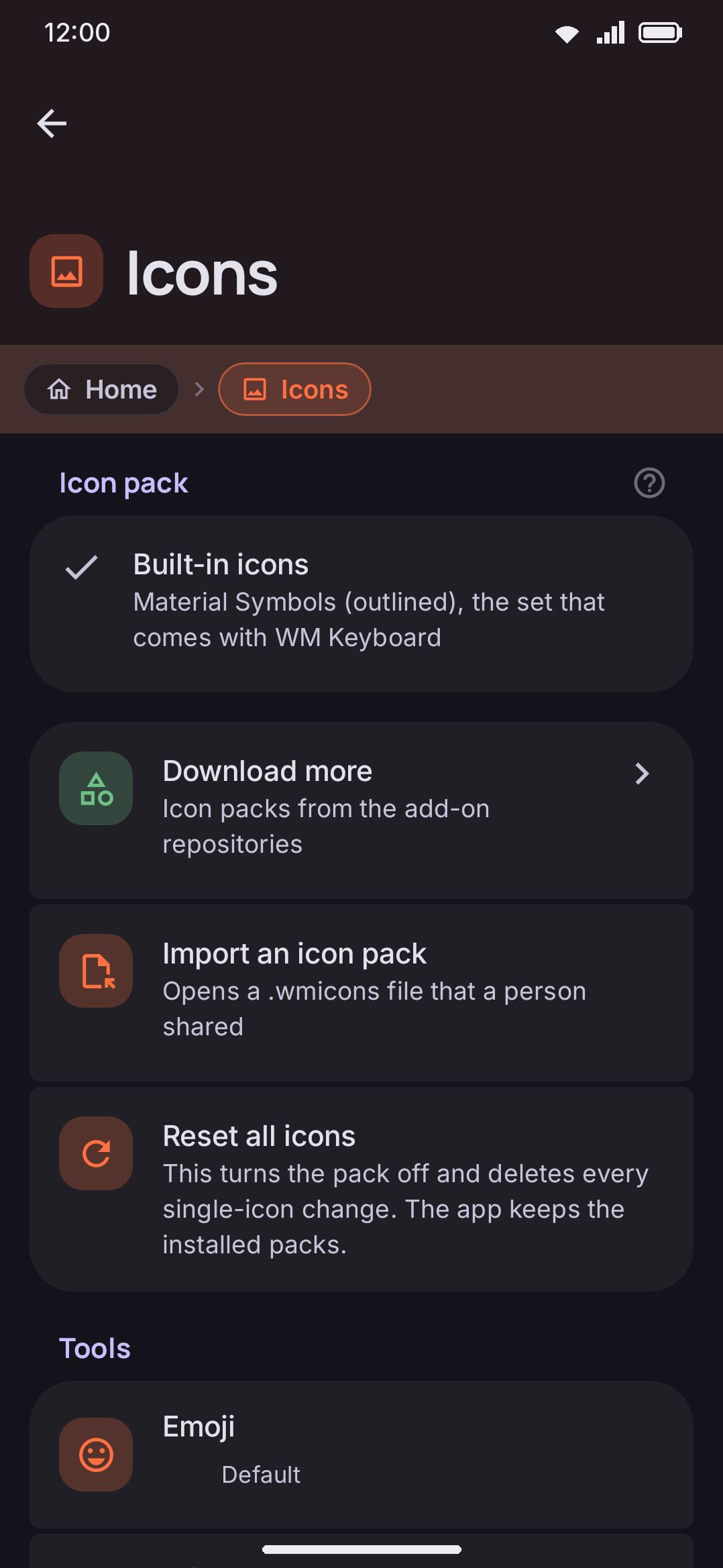
Every glyph the keyboard draws around your keys (toolbar tools, the Shift and Enter keys, the emoji tab strip) is a named icon slot you can replace. Change one icon at a time, or install a pack that redraws the whole set.
What you can replace
Section titled “What you can replace”There are 107 replaceable slots, split into four groups:
| Group | Covers | Count |
|---|---|---|
| Tools | Every toolbar tool’s own icon (clipboard, GIF, voice, and so on) | 72 |
| Keys | Shift (off/on/locked), backspace, forward delete, globe, switch keyboard, emoji key, and Enter in each of its wordings (search, send, go, next, previous, done) | 15 |
| Toolbar chrome | Toolbox, back-to-keys, show-tools, emoji shortcut, close search, incognito badge, power saving badge | 7 |
| Emoji tabs | Search, recent, most used, and one per emoji category | 13 |
The tools group grows on its own as new tools ship, since it’s generated from the app’s tool list rather than hand-maintained. A pack doesn’t have to cover every slot: anything it leaves out keeps the app’s built-in icon, so a two-icon pack that only reskins Shift and Enter is a completely normal thing to install.
One thing icon packs deliberately don’t touch: the per-key glyphs a language layout author drew into that layout. Those belong to the layout, not to the app’s chrome, so swapping icon packs never changes how a layout’s own keys look.
Colour. An icon that sets no colour of its own (none, currentColor, or nothing at all) is drawn in the current theme’s colour, and picks up that tool’s own accent colour if Colorful tool icons (under WM KeyboardTools) is on. An icon that sets real colours draws exactly as authored and stops following the theme. Most packs should lean on the first behaviour; only go colourful on purpose.
These are ordinary SVGs, read by a small built-in parser rather than a full SVG engine. It supports paths, basic shapes, and simple color and transform attributes. Gradients, filters, embedded images, and <use> references are skipped quietly rather than rejected. A <!DOCTYPE> is the one thing that isn’t forgiven: that file is refused, dropped from the pack with a note saying so, and the rest of the pack installs around it. See Icon packs in the addon repository format for the exact supported subset, the size limits, and why the declaration is refused.
Replacing a single icon
Section titled “Replacing a single icon”Tap any slot in the list to open its picker. Choose an icon from the built-in Material Symbols set, or tap Use my own SVG… to import a file of your own (under 256 KB).
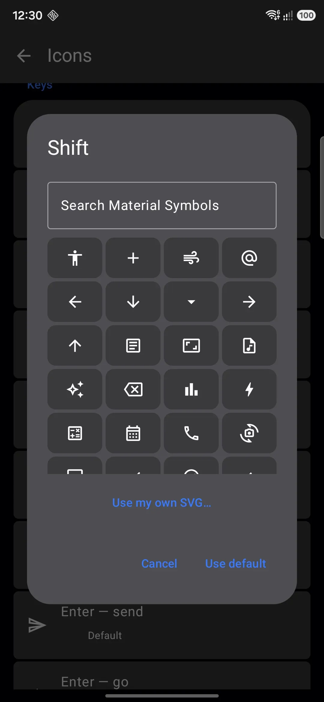
A single icon you import this way goes into a reserved pack called My icons, and that slot is pinned to pull from it. Pick custom SVGs for a few more slots and they land in the same pack, so “My icons” quietly becomes a real, exportable pack as you go. See Making your own pack below.
Reset all icons turns off the active pack and clears every per-slot choice in one tap. It’s a full reset, not only the single-icon changes. Installed packs stay on the device, so delete a pack separately if you want it gone.
Installing a pack
Section titled “Installing a pack”A pack can come from two places, and both end up in the same list of installed packs.
From an addon repository. Icon packs are one of the addon types a repository can host. They’re capped at 8 MB and, unlike dictionaries or sticker packs, can’t be previewed before you install. A set of glyphs is hard to judge from a text description, so it’s install-and-look. Installing is a two-step handoff. The pack lands on the device first, then a dialog asks “Use its icons on the keyboard now?” with a Switch to it button. Declining leaves the pack installed but inactive, so you can come back to it later from the Icons screen without reinstalling.
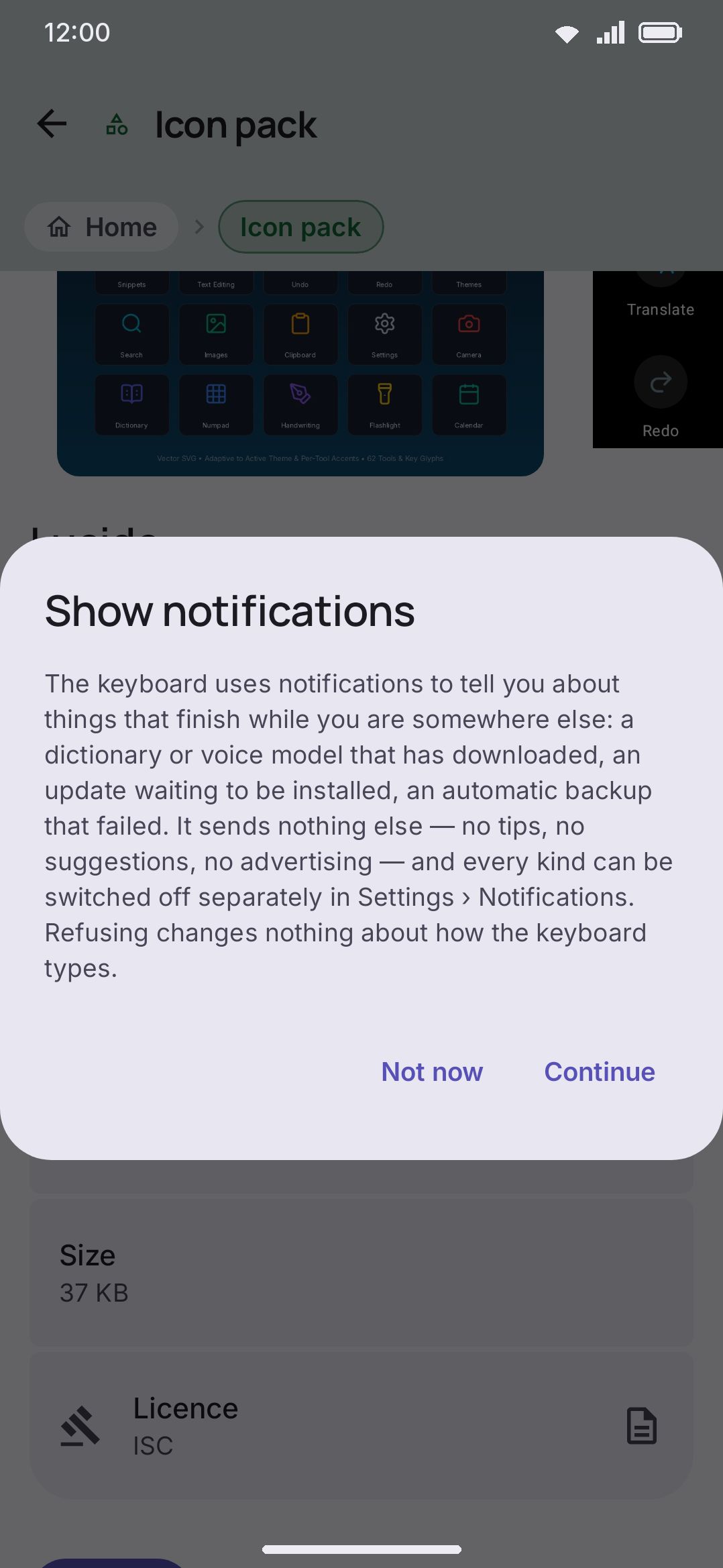
Importing a file directly. You don’t need a repository at all: Import an icon pack on the Icons screen opens a file picker for any .wmicons file, the same format a repository ships. This is the flow for a pack a friend sent you directly rather than one hosted anywhere. Importing switches to the pack immediately, since installing one and not using it isn’t usually what you wanted.
Either way, the device holds at most 20 icon packs at once (the reserved “My icons” pack counts toward that total too), and every SVG inside a pack is still limited to 256 KB.
Making your own pack
Section titled “Making your own pack”There are two ways to end up with a pack of your own. One suits a pack you’re building for yourself. The other suits one you mean to publish.
Build it in the app. Pick custom SVGs slot by slot from the per-slot picker described above. They accumulate into the reserved “My icons” pack on their own. When you’re happy with it, tap the export icon on that pack’s row on the Icons screen to save it as a real .wmicons file through the system file picker. There’s no manifest to write by hand, which makes this the fastest way to get a working pack you can keep or hand on.
Hand-author a manifest for a repository. A .wmicons file is a renamed ZIP: a pack.json manifest plus one SVG per replaced slot, named after the slot id (icons/tool.clipboard.svg, icons/key.shift.svg, and so on). The full manifest shape, the slot-id table, and the supported SVG subset are documented once, in Icon packs under the addon repository format. Follow that spec when you publish a pack into a repository. Export a pack from the app first, as above, and you have a real seed file to edit by hand.
Options
Section titled “Options”- Icon pack picks which installed pack supplies icons for every slot you haven’t overridden individually. Default: none (built-in icons).
- Per-slot overrides are the icons you’ve set one at a time from the slot picker. None by default.
- Import an icon pack opens a
.wmiconsfile someone shared, without going through a repository. - Reset all icons turns off the active pack and drops every per-slot override in one step. Installed packs stay on the device.
- Use my own SVG… sets one slot from an SVG file of your own, from inside that slot’s picker.
When a slot could be filled three different ways, a single icon you picked by hand wins over an active pack, and an active pack wins over the app’s own default. Overriding one icon from a pack you’ve installed sticks even after the pack updates or gets swapped out.
A related setting worth knowing about: WM KeyboardTools has Colorful tool icons (on by default), which is what makes a monochrome tool icon (built-in or from a pack) pick up that tool’s own accent colour instead of a flat theme colour.
Details & edge cases
Section titled “Details & edge cases”- Deleting a pack cleans up after itself. Along with the pack’s own files, deleting it drops any per-slot override pinned to it, so those slots go back to the built-in icon right away rather than pointing at something that no longer exists. Installing a different pack under the same id later doesn’t bring the old per-slot choices back. You’d pick them again from the slot picker.
- Deleting the active pack turns off the “active pack” setting as well as removing it from the list. Any slot that was relying on it, and wasn’t separately overridden, reverts to the built-in icon.
- No edition restriction. Icon packs work the same way on both editions of the app; nothing here is limited to one.
- Icon packs travel with backups. They’re one of the sections you can choose to include in a full settings export (off by default, since the SVGs add to the file size), so a restore on another phone can bring your custom icons along too.
- A pack’s own
slotslist is advisory, not authoritative. The app looks at what’s actually inside the archive and keeps anything that matches a slot it recognizes, so a pack assembled by hand still installs correctly even if its manifest is out of date.