
Theme editor
Every color, key shape, gradient, corner and animation knob for a single custom theme.
The theme editor is where a single custom theme gets built: every color, the key shape, optional gradients, corner-radius overrides, and a live-animated background if you want one. Every field here applies and saves the instant you touch it. There’s no separate save step.
Creating a theme
Section titled “Creating a theme”A custom theme’s card opens the editor from its pencil, and the card’s miniature grows into the editor’s own preview on the way. The editor is headed with the theme’s name rather than with the words “Edit theme”, so the card you tapped and the page it opened read as one thing. Rename the theme and the heading follows.
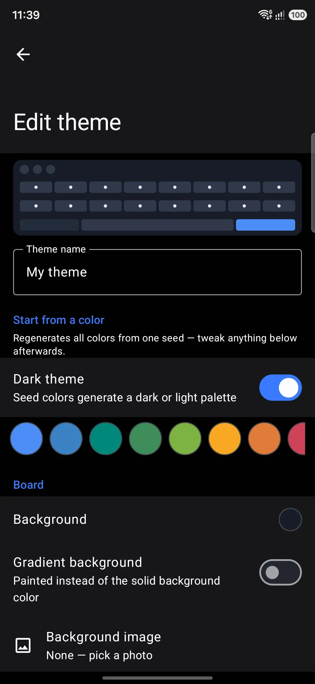
Create theme on the gallery screen makes a new custom theme called “My theme”. It’s seeded from a blue swatch and generated light or dark to match whatever the phone is set to right now. The new theme becomes the active keyboard theme, then the editor opens on it.
Built-in themes can’t be edited in place. Their card shows a pencil instead, which copies the built-in into a new custom theme named “(theme) copy”, makes the copy active, and opens the editor on the copy. The original built-in is untouched. The Default (system) card has no pencil at all. It’s generated live from your device’s Material You color scheme rather than stored anywhere, so there’s nothing for this editor to open. See Theming overview for the gallery itself and how Default, Material You, and the built-in set fit together.
Importing a .wmtheme.json file (from the gallery’s Import button or by opening the file itself) adds it to Your themes and switches the keyboard to it immediately, without opening this editor. See Sharing themes for both ways to import.
The Looks row
Section titled “The Looks row”Straight under the preview, before the name field, sits a Looks row: one chip per look this theme carries, an Add look chip, and (while you have a look other than the first one open) a bin icon that deletes the one you’re editing. Everything below that row edits the open look and nothing else, so a theme with four looks is four full colour sets, switched between with a chip.
A theme starts as one look, and the row is just the one chip until you press Add look. Add a second and a Group name field appears below the chips: that’s the label the gallery card shows over the dots. Add look copies the look you have open, so the new one starts where the old one left off, and it greys out after twelve extras (thirteen looks in all).
Theme families and looks is the full story: what a family card looks like in the gallery, the Grouped/Separate choice, and what happens to a family when you copy, export or delete it.
Starting from a color
Section titled “Starting from a color”At the top of the editor, a Dark theme switch and a row of swatches let you regenerate every color at once from a single seed:
Tapping a swatch, or flipping Dark theme, recomputes the board, key, accent, and popup colors from that seed and shade. It preserves everything that isn’t seed-derived, so a reseed doesn’t erase work you’ve done elsewhere in the editor. Your background image and its opacity/blur, both gradients, the key shape, the key border color and width, the gesture-trail color, all three corner-radius overrides, and the animation type and speed all carry over untouched. Anything you hand-picked that is seed-derived (a manually recolored key-text or popup color, say) gets overwritten, since there’s no way to tell “kept the default” apart from “picked to match.”
Following your wallpaper
Section titled “Following your wallpaper”Under the seed swatches, Follow wallpaper colors makes the theme change color with your wallpaper, the way the Default theme does with Material You on. It’s off for a theme you make, and it needs Android 12 or later, because older phones have no wallpaper palette to read.
The theme keeps its own colors. The keyboard moves them onto your wallpaper’s palette as it draws them, so turning the switch off gives you the stored colors back, and the color rows in the editor always show the stored ones. How the colors move depends on where the theme came from:
- Most themes (your own, copies of built-ins, Gboard, Rboard and HeliBoard imports) keep how light or dark each color is and take the wallpaper’s hue. Greys go to the wallpaper’s neutral tones, colors go to its main accent, and a color on the far side of the color wheel from the theme’s accent goes to the wallpaper’s third accent, so a two-color theme stays two colors. Because the lightness stays put, text that was easy to read stays easy to read. Pure black and pure white stay as they are.
- FlorisBoard themes written in Material You colors, such as FloriStyle and Gboardish, remember which Material You color each part used. They follow the wallpaper exactly as they would in FlorisBoard, and the switch is already on when you import one. A color you change in the editor stays the color you picked.
Tapping a seed swatch or flipping Dark theme keeps the switch as it is.
Options
Section titled “Options”The rest of the editor is grouped into sections, each opening the color picker when you tap a row.
The color picker
Section titled “The color picker”Every color row in the app opens the same dialog, here and over in the tool screens:
- A wheel for hue and saturation. Hue runs around it, saturation runs outward from the middle, and the ring follows your finger from the moment you touch it.
- A Brightness bar, plus an Opacity bar on the fields that support translucency. Each bar is painted in the colors it’s about to hand you, and the opacity one sits on a checkerboard so you can see how much is showing through.
- A preview strip across the top, split down the middle: the color you opened with on the left, the color you have now on the right. Tap the left half to throw away the change and start again.
- A Hex field taking three, six or eight digits, with or without the
#. Six digits keeps whatever opacity you already set rather than resetting it to solid. - A row of presets, the same seeds as the swatch row above. Tapping one changes the color and leaves your opacity alone, so a scrim you’ve already made translucent stays that way.
The button in the dialog’s title swaps the wheel for Hue and Saturation bars, for when you’d rather read exact numbers or move one channel at a time. Those bars are also the ones TalkBack can set. In landscape the wheel sits beside the bars instead of above them.
-
Background is the board’s base color. It supports alpha, which starts to matter once a background image is set. See Image backgrounds for the image picker, crop, opacity, and blur controls that live in this same section.
-
Gradient background is covered under Gradients below.
-
Suggestion strip fills the bar the word candidates sit on, and every other bar around the keys with it: the toolbar row, the emoji row, the symbol row, the dictionary bar, the fancy text bar and the selection macros. Those rows stack straight against each other, so one color across all of them is the only thing that reads as deliberate. It sits on Auto until you pick a color, and Auto means the bars carry the board straight through, gradient, image, animation and all. Alpha works here, so a half-transparent fill tints the board rather than covering it. One thing to watch: the words on the strip take their color from the board, not from this fill, so if you paint the bars a long way from the board color, set Suggestion text under Panels and suggestions to match.
-
Navigation bar fills the band below the bottom key row, where the phone’s own gesture bar or navigation buttons sit. Auto leaves it on the board, the same as the strip. Only the system’s own band is painted. The extra space that Bottom padding (under WM KeyboardLayout & sizeSize and position) adds above it belongs to the keyboard and stays on the board. On a phone with hardware navigation keys there is no band at all, so the color has nothing to paint and nothing changes.
On Android 15 and later the keyboard draws that band itself, so a gradient, image or animation carries through it. On Android 14 and earlier the keyboard window stops short of the bar and can only hand the system one flat color, which it does: the Navigation bar color if you set one, otherwise the far end of the gradient, otherwise the board color. Either way the bar follows the theme instead of staying whatever color the phone picked, and the system’s hide-keyboard and language-switch glyphs flip between dark and light to stay readable on it.
- Key shape: a row that opens a picker with None and all twelve shapes listed by name, each drawn beside its name at key proportions and at this theme’s own corner radius, so you can see what you’re choosing before you choose it. The full list, and which shapes react to the radius slider, is under Key shapes below.
- Letter keys sets their color, and carries an optional Key gradient, a subtle sheen painted over letter keys only (see Gradients).
- Key text, Modifier keys, Modifier key text (falls back to Key text when left on Auto), Key hint text (the small long-press alternate in a key’s corner; Auto draws the key’s own text color at 55% opacity, and this one keeps alpha so you can pick a translucent hint in another hue), Enter key, Enter key icon.
- Pressed key is the color a key flashes while held. Auto derives it from Letter keys.
- Key border stays off (Auto, no visible border) until you pick a color. A Border width slider (0–3dp) then appears, starting at 0dp. Picking a border color on its own shows nothing until you raise the width too.
Key shapes
Section titled “Key shapes”The picker lists None first, then the twelve shapes in this order. The five simple ones come first, then the seven decorative ones:
| Shape | What it looks like | Reads the radius slider? |
|---|---|---|
| None | No shape at all, just the labels on the board. See No key shape below | Only for the flash while a key is pressed |
| Rounded (default) | The ordinary rounded rectangle | Yes, 0–28dp |
| Square | Four sharp corners, no rounding at all | No |
| Pill | A full stadium, rounded to half the key’s height | No |
| Cut | Corners chamfered off at 45° | Yes, but clamped to 2–14dp |
| Squircle | A superellipse, the same curve family as an iOS app icon | No |
| Arch | Round across the top, nearly square at the bottom | No |
| Leaf | Top-left and bottom-right fully round, the other two nearly square | No |
| Slanted | A parallelogram, both vertical sides leaning right | No |
| Hexagon | Points at the left and right, flat top and bottom | No |
| Scalloped | A rim of even bumps, like the edge of a biscuit | No |
| Ticket | Corners bitten inwards by a circle, like a cinema ticket | No |
| Circle | A round cap centred in the key, like a typewriter’s; wide keys (space, enter) keep a stadium | No |
The shapes that ignore the slider aren’t being lazy about it. Their whole look is a proportion of the key rather than a corner size, so they measure themselves off the key’s own width and height. The arch is always half the key’s height. The hexagon’s points are always a sixth of its width. The scallops count out at roughly the same size whether it’s a letter key or a spacebar. Wire them to a 0–28dp slider instead and one end of it flattens them into plain rectangles.
Only the drawing changes. Touch targets stay rectangular for every shape, so the gap between two hexagons still belongs to one key or the other, and nothing gets harder to hit.
Slanted is the one shape that draws slightly outside its key. A parallelogram kept inside the key would lose about a third of the width at the top and the bottom, which on a phone-sized key reads as a row of thin straps. So it leans half its slant into the gap on each side instead. Every key stays exactly as wide as it would be with any other shape, and the gap between two keys keeps its width. The gap just runs on a diagonal. Where there is no gap to lean into, the lean is trimmed to fit.
Key shadow
Section titled “Key shadow”Key shadow lifts every key off the board, 0 to 16 dp. It’s drawn by the platform from the key’s own outline, so it follows whatever shape you picked.
Two shapes stay flat however far you push it. Scallop and Ticket are concave, and Android tessellates a concave shadow through a path that pins the render thread hard enough for the system to kill the keyboard, so they keep the shape and lose the shadow. A key you can see through stays flat too, since a shadow under nothing is just a smudge on the board. That’s what keeps a borderless theme looking borderless.
No key shape
Section titled “No key shape”None takes the shape away completely, which isn’t quite the same as a see-through key color. A key at rest draws no fill, no border and no texture, so every label sits straight on the board, Enter and the space bar included. The Enter icon switches to your Modifier key text color while it has no fill of its own, since Enter key icon is picked to read on the Enter key’s fill.
The keys still answer your finger. A pressed key flashes a rounded shape at your key corner radius, and an armed or locked modifier still lights up. A key you give its own face color under Single-key styles keeps that face, so a colored Enter key on an otherwise bare board is one style away. The keypads in the tool panels, like the calculator and the voice and handwriting rails, follow the same rule as the main keys.
High contrast keys and Key outlines in Accessibility both bring rounded keys back while they’re on. Keys without visible edges are exactly what those two settings are there to fix.
Key textures
Section titled “Key textures”Keys can wear an image instead of a flat color. One picture for the letter keys is enough to theme the whole board. The modifier keys, the enter key, the space bar, the pressed state and the key-preview popup each take an optional image of their own, and each falls back sensibly when you don’t set one: space reuses the letter texture, pressed draws the press tint over it, and the popup draws color-only rather than borrowing a key’s image.
- Each texture row picks an image from your gallery. It’s stored downscaled to 512px, so a camera photo won’t bloat the theme file. Rows that have an image show it as a small thumbnail, the same way the background and press-effect image rows do.
- Crop / Stretch / Tile decides how the image fits a key. Crop keeps its proportions, stretch fills the key exactly, and tile repeats it at its natural size. Tile is the one you want for pixel-art.
- Texture opacity blends the image over the key color underneath. That color stays the base coat, and it’s what high-contrast accessibility falls back to, since textures don’t draw there at all.
Textures travel inside the theme file when you export it. An older app version imports the same file as a plain color theme and loses nothing else.
Single-key styles
Section titled “Single-key styles”One key can carry a style of its own. Add a letter (the style follows that letter onto every layout that has it) or one of the special keys (Enter, Space, Shift, Delete, Symbols…), then set any of these. Everything you leave alone keeps following the theme, so a key that only recolors its hint carries exactly that.
- Colors: its face, its label, its hint, its border, and the two colors of the popup bubble it shows.
- Key image: a picture for this one key, drawn with the same Crop/Stretch/Tile fit and opacity the board’s key textures use, so a dressed key still reads as part of the set. It beats the class texture it would otherwise wear, and a key image works on a board with no class textures at all.
- Press effect: the burst this key throws — Stars, Hearts, Sparkle, Confetti, or Emoji with its own field for the emoji. It overrides the board’s key press effect for this key alone, and a board whose only effect is one key’s still bursts on that key. The board’s Intensity, Colour and the physics sliders shape every burst; a single-key style picks what is thrown, not how. Images aren’t offered per key.
- Key shape: this one key’s outline. Automatic follows the board’s shape; pick one to make a single key round, pill, cut or anything else in the list, including None. The board’s corner radius still decides how round a rounded key is, and the shapes that measure themselves off the key (circle, pill, hexagon and the rest) ignore it as they always do. This is how a round Enter key on a grid of soft rectangles is made, and it is what carries over from an imported FlorisBoard theme built that way.
- Bold label and Label size: how the label is drawn. Bold is a three-way choice — Automatic follows the board, On and Off answer for this key. Label size replaces the automatic rule rather than scaling it, which is how you get a
?123drawn at full letter size. A size the layout gave the key in the layout editor wins over the theme’s, since the layout is the more specific answer.
An armed or locked modifier still shows the accent or pressed face whatever color you gave it, because state has to stay visible. A key image and a press effect travel inside the exported theme the same way the board’s do. High-contrast accessibility drops single-key styles with the rest of the decoration, and a press effect never plays under reduce motion or power saving.
Stickers
Section titled “Stickers”Up to six images laid over the keys, purely for decoration: typing goes straight through them. Transparent PNGs work best. Each sticker has position, size, rotation and opacity sliders, adjusted over a live miniature preview so what you drag is what the keyboard shows. Stickers travel with the exported theme the same way textures do.
Key press effect
Section titled “Key press effect”A small particle burst under every key press. Pick Stars, Hearts, Sparkle, Confetti, Emoji with a field for the emoji to throw (each one becomes its own particle kind), or Images, which takes up to six of your own pictures from the gallery, each a particle kind the same way. Transparent PNGs look best. They’re stored small and keep their proportions in flight. An Intensity slider scales how many particles a press throws.
Six more controls shape every particle at the moment it spawns: a Colour picker (Natural, Key text, Accent, Trail, Custom, or Random) and five sliders, Size, Speed, Spread, Gravity (how fast particles fall; zero leaves them drifting, and below zero they float upward), and Duration (200-2500 ms). The effect never plays under reduce motion or power saving, and high-contrast accessibility drops it with the rest of the decoration.
Font and sound
Section titled “Font and sound”The theme can bring its own key font and key sound. You pick both from what’s on the device: the styles the app ships, plus anything installed from the font and sound libraries. The sound list holds your installed sounds and your installed sound packs, each as its own row, so picking one is picking the sound itself rather than a category. They’re referenced by name and never copied into the theme file. If someone imports your theme without that font or sound installed, their keyboard quietly uses their own global choice instead. Publish the font and sound as their own add-ons and list them under the theme’s requires in a repository manifest, so the install screen offers to fetch them together.
Key font covers Latin, Cyrillic and Greek. Every other script keeps its own face, because a Latin-only display font draws a Bengali board as empty boxes.
Add a font for a script is how a theme keeps its look on those boards anyway. Pick a script, pick a face that actually carries its glyphs, and that script uses it instead of its automatic Noto face. Add as many as you have fonts for; the scripts you skip are unaffected. A pixel theme usually needs one file per script, since a single pixel font almost never covers Latin and Bengali and Arabic at once. Each of these is another add-on to publish and list under requires.
Your own per-script pick in Appearance → Fonts still beats the theme’s. You chose that font on purpose, and a theme doesn’t get to overrule it.
For a theme you plan to share, use the forms that travel. Google Font ids (google:Caveat) resolve the same on every device, and an installed sound or font can be named by its catalogue name: “Typewriter” for a sound, installed:Bloxat for a font. The ids the libraries mint locally differ from phone to phone.
A theme’s sound is only ever a sound it can actually make. A theme whose sound is missing on this device — never installed, or since deleted — falls back to the global Key press → Sound style pick, and so does a theme file whose soundStyle is CUSTOM or PACK with no soundCustomId beside it. Those two styles name something installed rather than a waveform of their own, so without a name there is nothing to play, and overriding your own pick with silence-turned-system-click would leave the whole keyboard clicking with nothing on screen to say why.
Accent & popups
Section titled “Accent & popups”- Accent paints the shift-on tint, the active-tool color, and the buttons across the panels.
- Gesture trail is the color of the swipe-typing trail. Auto falls back to Accent, and the field supports alpha.
- Popup background and Popup text color the bubble that appears above a key on press. Both support Auto fallbacks, deriving from the board and key colors and from Key text respectively. Popup background supports alpha.
- Popup shape sets the outline of every popup surface the keyboard draws: the character bubble, the long-press alternates, the language list, the panel menus. It’s the same picker and the same twelve shapes as Key shape, drawn at this theme’s popup radius. Until you pick one, the theme follows WM KeyboardKey pressKey popupPopup shape.
- Popup placement decides whether the character bubble grows out of the pressed key (the stock style) or floats detached above it. Default leaves the choice to WM KeyboardKey press. The other two make it part of the theme, so a bubble-popup theme looks right on every phone it lands on.
- Popup outline and its width row draw a border around the bubble, off until you pick a color, exactly like the key border. It draws on every popup surface the keyboard opens: the character bubble, the long-press alternates, the spacebar language picker, the clipboard and emoji menus, and the small pickers inside the tool panels.
- The popup can also wear an image: the Key preview popup row under Key textures paints one inside the bubble, clipped to the popup shape, using the same Crop/Stretch/Tile mode and opacity as the key textures.
- Menu shape exists because the list menus (the spacebar language picker, the clipboard and emoji menus) don’t blindly follow the popup shape. On Automatic they take a safe derivative: the plain outlines (Rounded, Square, Cut, Squircle) pass through, and the decorative ones fall back to Rounded. A slanted character bubble is charming. A slanted menu clips its own rows. Pick a shape here only to overrule that judgement.
Toolbar
Section titled “Toolbar”- Tool background shape is the outline of the background behind each toolbar tool, from the same twelve shapes. It follows WM KeyboardAppearanceToolbarTool background shape until you pick one here. Nothing draws at all while the tool radius is 0, which is the setting for bare icons.
- Tool icons sets the toolbar’s icon color, Auto by default.
- Tool circles and Active tool circle paint the background behind a toolbar icon, at rest and while pressed or active. Both support alpha.
- Tool shadow lifts that background off the bar.
- Active tool icon colors the glyph sitting on an active tool. Auto picks whichever of black or white reads on the active circle, which is what this was before the row existed. Set it when the automatic pick is technically legible but not the colour you want.
- Tool outline and Tool outline width put a border around that background, off until you pick a color, exactly like the key border in Keys. The width row appears once a color is set, and nothing draws until it’s above 0. A theme that sets one keeps it even with the accessibility Key outlines toggle on.
Panels & suggestions
Section titled “Panels & suggestions”- Cards & search bar is the
chipBackgroundfield. It covers suggestion chips and the search-bar surface across the tool panels. Auto falls back to Modifier keys, and the field supports alpha. - Popup shadow lifts the key preview and the long-press alternates off the board.
- Selected highlight and Selected text color the letter your finger is on while you hold a key, and the selected row of the language list. Auto uses the accent, which is what these were before they had rows of their own.
- One-handed rail and One-handed rail icons color the strip beside the keyboard in one-handed mode. It used to draw in the settings app’s colors and ignore your keyboard theme entirely.
- Suggestion text colors the suggestion strip and the panels’ body text. Auto falls back to Key text, contrast-guarded against the board, so a theme whose keys invert against its board (dark ink on cream keys over a near-black board) still gets a legible strip. An explicit choice here is honoured as written.
- Secondary text colors the quieter text beside the main text: the second word of a suggestion, and the kind and time on a clipboard entry. Auto draws Suggestion text at 65% alpha, which is what it was before the row existed. Alpha works here.
- Dividers colors the hairlines between the parts of a panel and between suggestions. Auto draws Suggestion text at 25% alpha. Alpha works here too, so you can keep the rule faint in a hue of its own.
- Card shadow lifts the panel cards off the panel.
Chips & buttons
Section titled “Chips & buttons”Chips are the small tappable surfaces inside the tool panels: style pickers, tab strips, converter controls, dictionary suggestions, search bars, the cards in the clipboard, snippet, weather, calendar, grammar and plugin lists, and the buttons and fields a plugin draws. They take the card color above as their background, and this group styles the rest. The panels’ own keypads (calculator, numpad, the converters, the text-editing pad, the handwriting and voice rails) count as keys rather than chips. They follow the theme’s key shape and key border, so a circle-key theme gets circular calculator keys for free.
- Chip text and Selected chip / Selected chip text cover the resting label, plus the fill and label of the chip that’s currently active. Auto derives all three from the theme, and the selected fill follows the active tool circle.
- Chip outline and its width row draw a border around every chip, off until you pick a color.
- Chip shape and Chip corner radius use the same twelve-shape picker as everywhere else. The default is the 12dp soft rectangle chips have always drawn.
- Card shape governs the bigger surfaces: clipboard and snippet cards, plugin rows, search bars, the converters’ displays. They follow the chip shape through the same safety rule as the menu shape, so plain outlines pass through, decorative ones fall back to Rounded, and an explicit pick here overrules both.
Any row left on Auto shows an “Automatic” label under its name instead of a fixed value. Once you’ve overridden it, that row’s color picker gains an Automatic button (next to Apply) that clears the override and puts the row back on Auto.
Gradients
Section titled “Gradients”Both Board and Keys can carry an optional gradient, painted over their solid color and toggled on with a switch next to each. Turning one on seeds it with a sensible default that you can then reshape. The board gradient starts as a 135° linear blend from Background to Accent, and the key gradient as a subtle 90° white sheen.
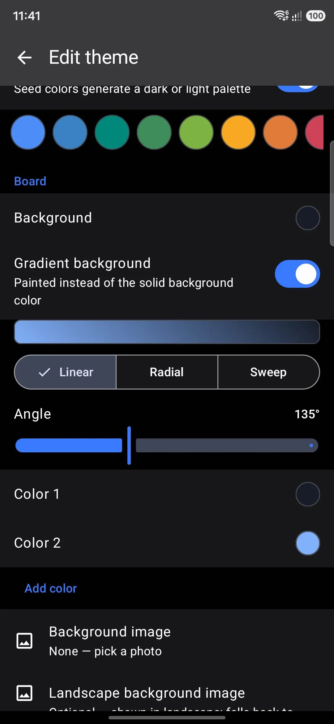
- Type: Linear, Radial, or Sweep.
- Angle: 0–360°, shown for Linear and Sweep only (Radial ignores it).
- Color stops: 2 to 4, each with its own color and alpha. Add color and Remove color grow and shrink the list.
Corners
Section titled “Corners”Off by default, so keys everywhere follow the global sliders (two under Appearance, one under Key press). Turning on Corner radii for this theme seeds three independent sliders for this theme alone, each starting at whatever its global counterpart is set to:
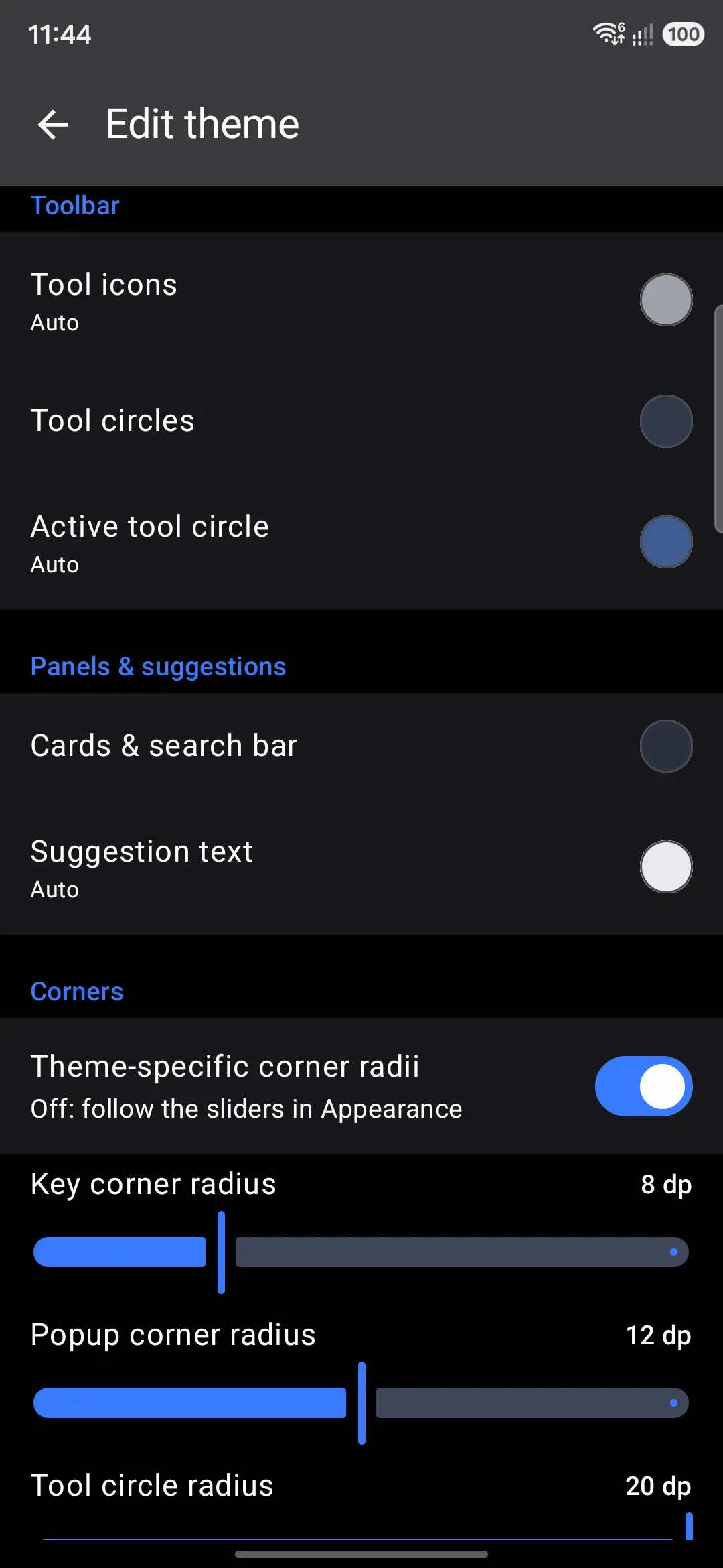
- Key corner radius: 0–28dp, seeded from the global Key corner radius slider (default 8dp) when you turn the switch on.
- Popup corner radius: 0–40dp, seeded from the global Popup corner radius slider under WM KeyboardKey press (default 12dp).
- Tool circle radius: 0–20dp, where 0 draws no background behind the icon at all (the slider reads “Off” there), seeded from the global Tool circle radius slider (default 20dp).
Layout
Section titled “Layout”A second opt-in group, Layout for this theme, works the same way: one switch seeds a set of size overrides from your current global settings, and turning it off clears them all again. Tool background width, toolbar height, popup height, key height, key gap, left and right padding, key label size, bold labels, corner hint size, and the gesture trail’s width and opacity all live here. Screen-specific sizes from Layout settings (folded, unfolded, landscape) still win over a theme’s own.
Popup height is the height of the key-preview bubble. The global slider under WM KeyboardKey press keeps one value for the on-key bubble and another for the floating one, and the theme keeps the same pair. The slider here shows and edits the height of the style the theme is drawing, its own placement if it names one and otherwise the global one, and the other style’s height stays as it was. An on-key bubble is also never drawn shorter than the key plus its label, whatever height it is given, so it cannot vanish under your finger.
Animation
Section titled “Animation”Adds continuous motion to the board while the keyboard is on screen:
- None (default), Flow, or Hue cycle, as a segmented picker.
- Flow drifts the board gradient along its own axis (or orbits its center, for a radial gradient). Hue cycle slowly rotates the hue of the board gradient, or the solid board color if no gradient is set.
- A Speed slider (0.25×–3×, default 1×) appears once animation is on.
Only three built-in themes ship with animation turned on: Sunset drift and Cyberpunk use Flow, Aurora uses Hue cycle. Every other built-in, and every fresh custom theme, starts on None.
Live preview while you edit
Section titled “Live preview while you edit”The keyboard itself is pinned at the top of the editor, drawn small enough to leave room for the controls but at the proportions it has on screen. It is the real keyboard, not a picture of one: press a key and it flashes, the popup rises, the key effect fires, the strip shows the word, and a Flow or Hue cycle animation moves. Every change you make below redraws it at once, and switching looks or themes crossfades the way the keyboard does.
Typing goes into the preview alone. Nothing you type there reaches an app, is learned, or is saved. The keys work the way they do when you type: shift and caps lock, the ?123 and ABC keys, the globe key cycling your enabled languages, and the emoji key and the toolbar tools opening their panels in the theme. Tools that need something the editor does not have, a microphone or your clipboard history for example, open their panel and stop there.
The floating keyboard button at the bottom right opens the same keyboard at full size, docked along the bottom of the screen with the sections scrolling above it, the way an app sits over the keyboard. A line above the keys shows what you type, with a button to clear it. Tap the button again, press Back, or use the keyboard’s own hide tool to put it away.
Duplicating and deleting
Section titled “Duplicating and deleting”There’s no Save or Apply button anywhere in this screen: every field write goes straight to storage, so closing the editor (or the app) never loses anything or asks you to confirm.
Duplicating an existing custom theme isn’t available from inside the editor itself; the copy-then-edit flow described in Creating a theme only applies to built-ins, from the gallery.
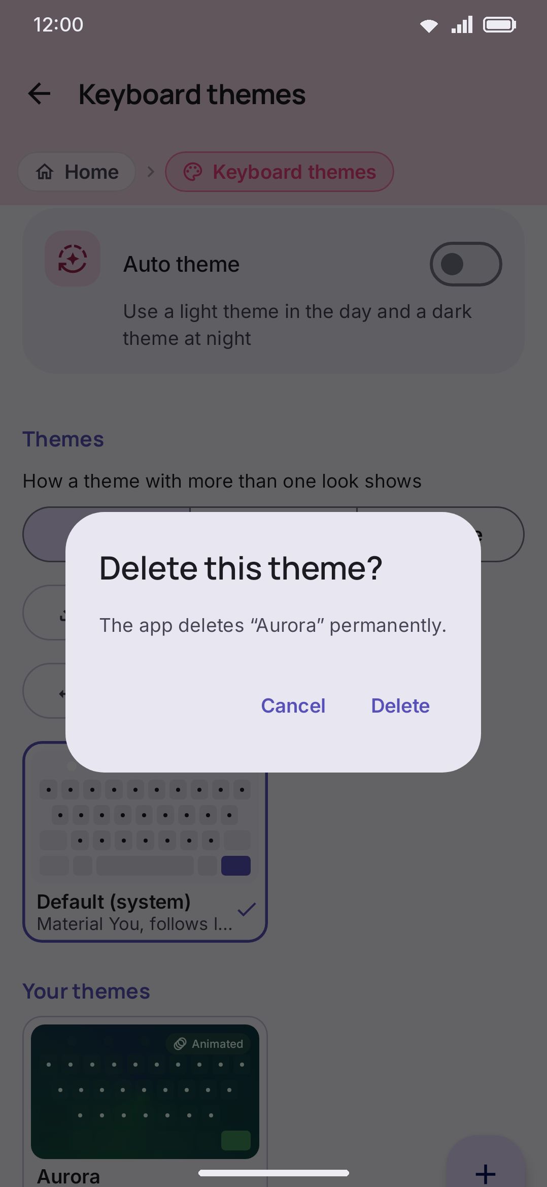
Deleting a custom theme is a gallery action too: tap the trash icon on its card. A confirmation dialog asks “Delete this theme?” with a note that it will be removed permanently. The theme’s image files (background, textures, stickers, particles) are not deleted with it. A housekeeping pass clears them once nothing in any theme still points at them, and only after they have been unreferenced for a day, because looks in the same family share their files:
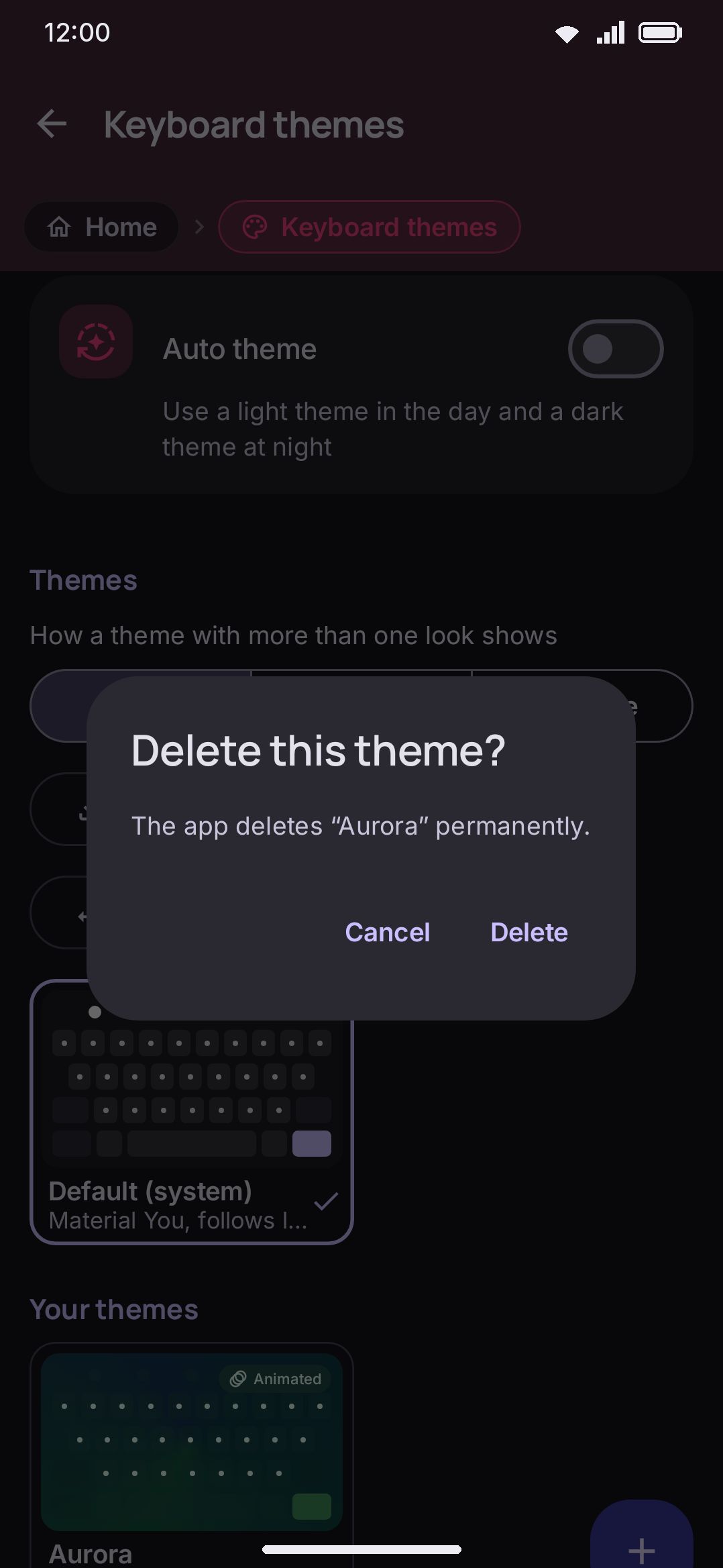
Delete isn’t offered for built-in themes or for the Default theme, only for themes in Your themes. Export is offered on built-in cards as well, so you can hand someone a copy of one as a file; only the Default card has no export button, since it’s generated live rather than stored.
Details and edge cases
Section titled “Details and edge cases”- Editing an existing custom theme doesn’t switch to it. Tapping the pencil on a theme already in Your Themes opens the editor without changing your active keyboard theme. Only Create, Duplicate (from a built-in), and Import set the edited theme as active, as a side effect of those actions rather than of editing.
- Typography is part of a theme, but only once you set it. The key font, the per-script fonts, key label size, bold key labels and corner hint size are all theme fields. Each one is empty until you touch it, and an empty field follows your global setting instead. So a theme you never gave a font to picks up whatever Keyboard fonts is set to, and changing that global font changes how the theme looks. Give the theme its own font and the global one stops applying to it. The sizes work the same way through the Layout for this theme switch.
- The key-preview bubble has no band to rise into here. On the real keyboard, the bubble for a top-row key is drawn in an empty strip of window kept above the board, over whatever app you are typing into. The preview has no window of its own, so it holds no such strip — keeping one would be dead space taken out of the board’s own room, and on the miniature it cost the board most of the width it had. The docked keyboard draws that bubble over the sections above it instead, the way the real one draws it over the app; the miniature, which is clipped to its own rounded corners, sits it on the board’s top edge rather than letting it be cut in half.
- Two “Auto” swatches don’t match the real keyboard. Pressed key and Active tool circle, when left on Auto, are worked out by a different formula in the editor’s swatch than on the board itself. The swatch blends the key colour 40% toward the accent; the keyboard blends it 25% toward the key text. On a theme with a strong accent the two are visibly different colours, so trust the live preview over the swatch. Every other Auto fallback (popup background, tool circles at rest, and so on) matches exactly.
- A theme’s background image lives in this same editor, under Board, but the picker, crop dialog, and opacity/blur sliders are covered in full on Image backgrounds rather than here.
- Corner-radius overrides here are theme-specific; the sliders they inherit from and the global key-shape basics are covered in Theming overview.
- Exporting, importing, and installing a theme from a repository are covered in Sharing themes, including what happens to a theme’s colors and images when it travels as a file.