
Theming overview
Material You, light/dark/AMOLED, and automatic theme switching.
WM Keyboard’s look is driven by a theme: a full set of colors, gradients, key shapes and corner radii bundled together. Pick a built-in theme, let it follow your wallpaper, switch it automatically between day and night, or build your own from scratch.
Choosing a theme
Section titled “Choosing a theme”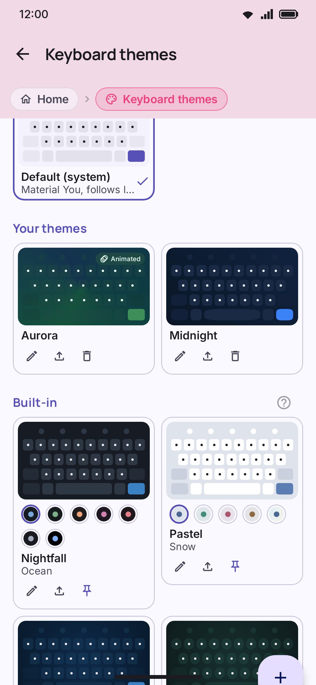
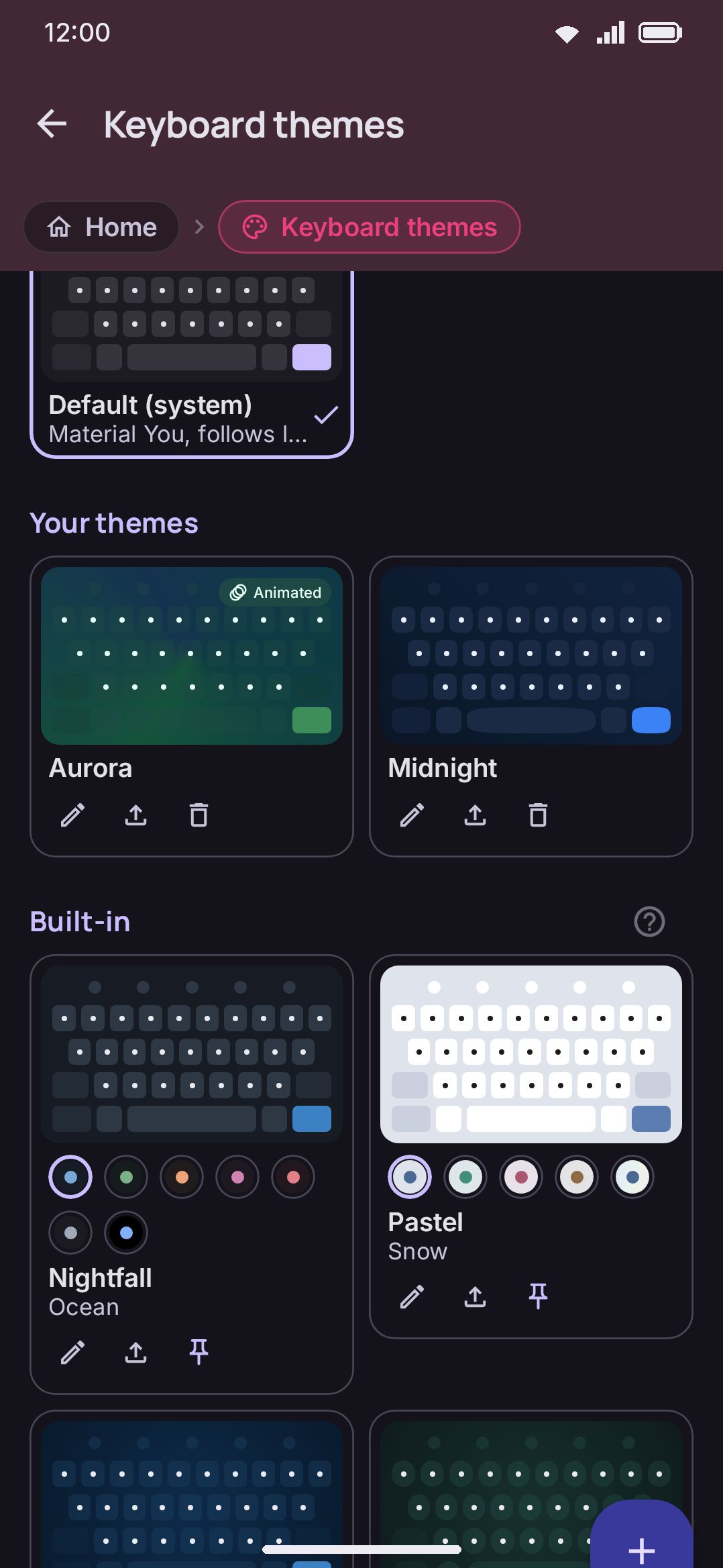
The theme gallery is a two-column grid: the Default (system) card first, then your saved custom themes (if you have any), then every built-in theme below them. Tapping a card applies it to the keyboard immediately.
The toolbox also has an Appearance tool that draws live mini-previews right over the keys. It carries a shortlist rather than the whole gallery. Your custom and downloaded themes always show up in it, along with whichever built-ins you pin: each built-in card in the settings gallery carries a pin that adds it to the tool or takes it out, and a fresh install starts with a spread of six. That makes the tool a quick mood switch, with a handful of favourites to flip between mid-typing and the full collection one tap away in Settings (the tool’s caption says so too). The tool runs full-bleed. The toolbar row hides while it’s open and its space becomes a header, with a back button on the left and the Themes / Icons / Emoji / Fonts tabs beside it, so the cards get the reclaimed rows. On the Themes tab, pressing a card while Auto theme is on sets whichever half of the pair, light or dark, is due right now. The grid goes read-only only when that half is set to Random, or when the active keyboard mode carries a theme of its own. A caption at the top names which of those two is holding it.
There are 29 built-in themes. Nineteen are original WM Keyboard designs: plain colours like Ocean and Forest, gradient showcases like Nebula and the animated Sunset drift and Aurora, two shape showcases (Bubble for pill keys, Facet for cut corners), and Cyberpunk, which puts the whole feature set on screen at once. The other ten (Dracula, Alucard, Nord, Solarized Dark, Solarized Light, Catppuccin Mocha, Catppuccin Latte, Catppuccin Frappé, Catppuccin Macchiato and Tokyo Night) are ports of well-known editor colour schemes. Alucard is Dracula’s own light half, spelled backwards, so it draws as a second look on the Dracula card rather than a theme of its own. Cyberpunk is filed beside them in the source because it is written in that style, but the palette is ours. The MIT notices for the ones with upstream licences ship in the app’s About screen.
They don’t all get a card of their own, though. Twenty-four of the 29 belong to one of six families (Nightfall, Pastel, Gradients, Dracula, Solarized and Catppuccin), and a family shows as a single card with one dot per look, so the grouped built-in grid is eleven cards rather than 29. Theme families and looks covers the dots, the Grouped/Separate choice, and building a family of your own.
None of the built-in themes are editable in place. Tapping the pencil on one makes a copy in Your themes and opens the editor on that copy, before you have changed anything, so the originals stay put as a fallback you can always get back to. See the theme editor for building or duplicating a theme, image backgrounds for putting a photo behind your keys, and sharing themes for exporting, importing, and addon repositories.
Matching your wallpaper
Section titled “Matching your wallpaper”Turn on Material You colors and the Default (system) theme pulls its palette from your phone’s wallpaper, the same way Android’s own system UI does. It’s off by default, because the app and the Default theme ship with a palette of their own — the deep indigo and violet the launcher icon is built from — and wallpaper color replaces it. It only takes effect on Android 12 and up. The switch still shows on older versions, where it has nothing to do. This switch only changes the Default theme, and it recolors the settings app as well as the keyboard.
Any other theme can follow the wallpaper too, one theme at a time. Open it in the theme editor and turn on Follow wallpaper colors. That works for your own themes, copies of the built-in ones, and themes imported from FlorisBoard, Gboard, Rboard or HeliBoard. A FlorisBoard theme written in Material You colors, such as FloriStyle, has it on from the moment you import it.
Dark mode and AMOLED
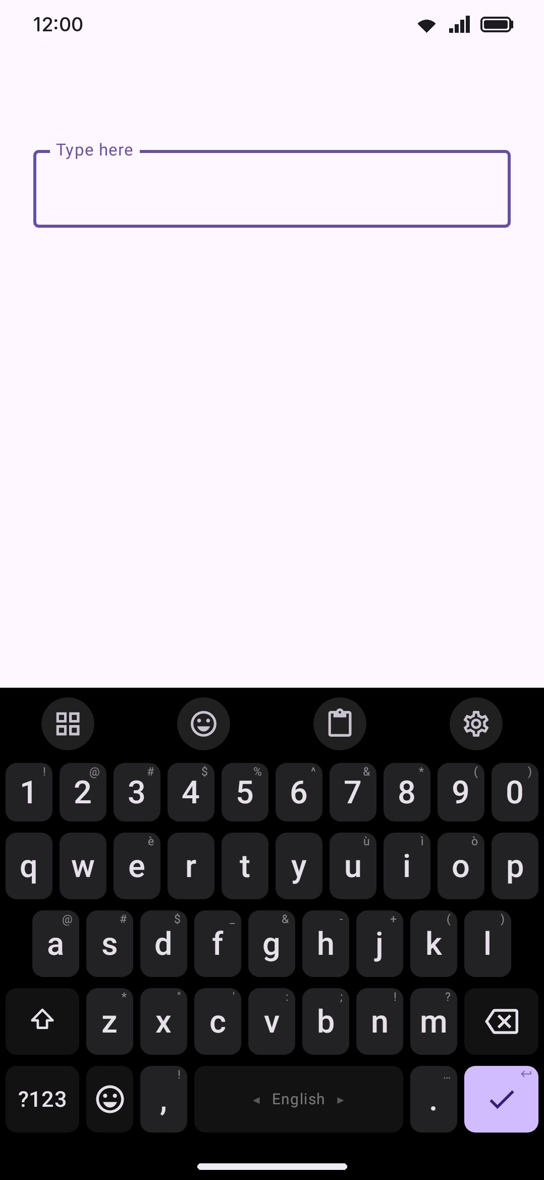
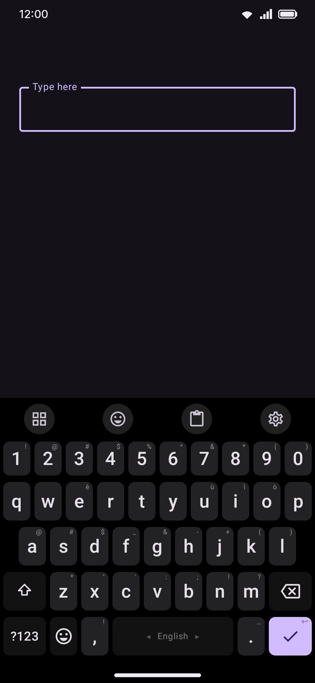
Section titled “Dark mode and AMOLED”Mode is a four-way switch: System, Light, Dark, or AMOLED. Like Material You colors, it controls both the settings app and the Default theme. AMOLED always renders dark, and unlike System it doesn’t wait on the phone’s own light/dark setting. It forces the Default theme’s board to pure black, and blacks out the settings app the same way — page, rows, bars, dialogs and sheets, not just the page behind them. Keys and other surfaces stay near-black blended tones rather than literal black, so key edges and the edges of settings rows are still visible against the black behind them. Built-in and custom themes ignore Mode entirely. If you want an AMOLED look on a fixed palette, the built-in Pitch black theme gets you there with its own true-black board.
Switching automatically
Section titled “Switching automatically”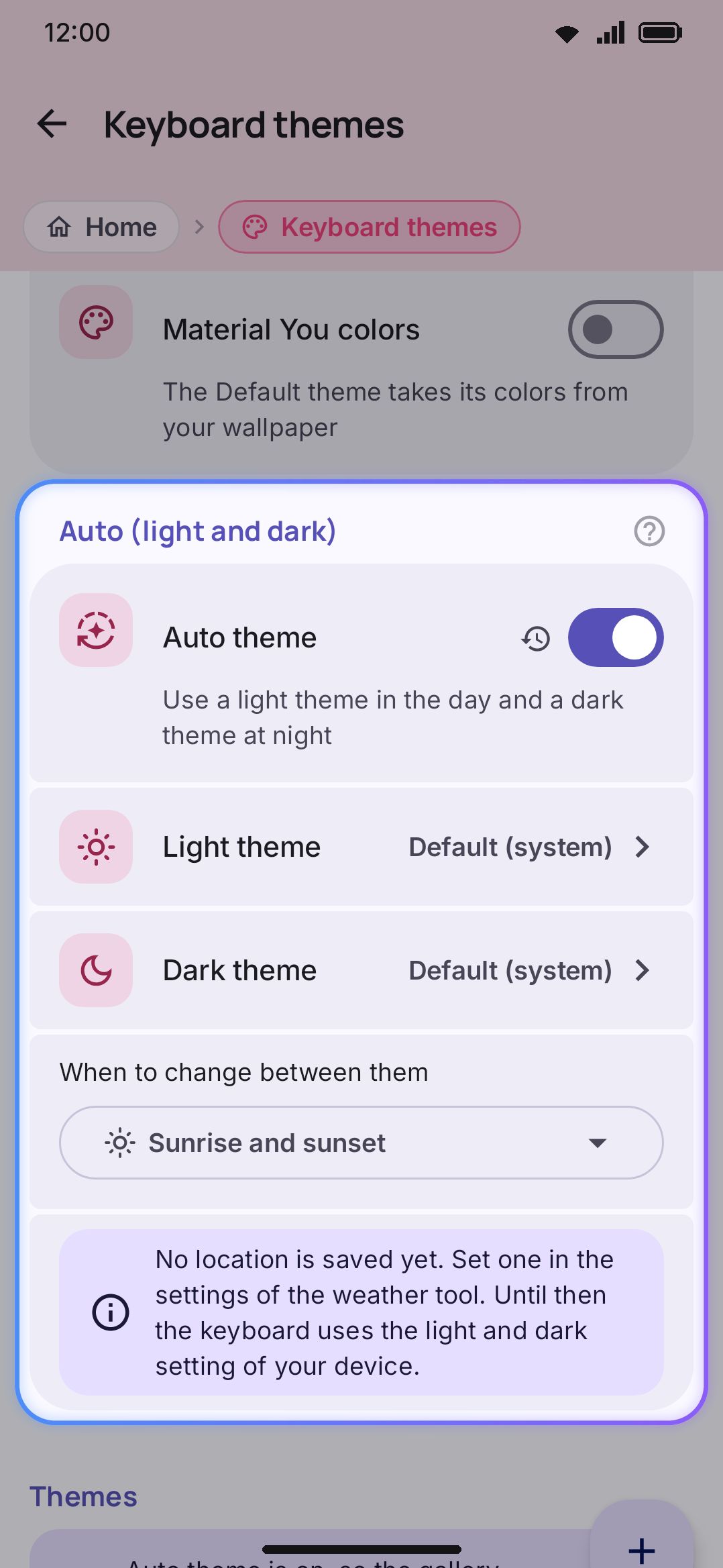
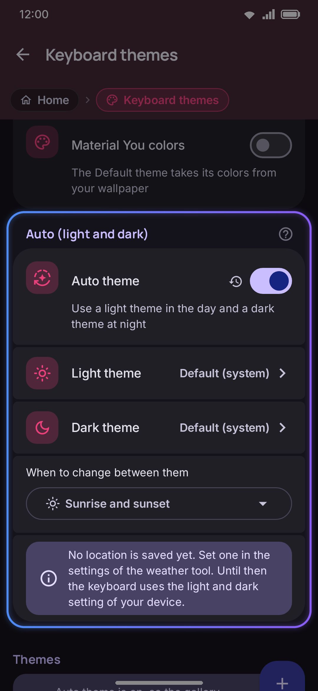
Auto (light and dark) picks two themes (one for day, one for night) and swaps between them on its own, using one of three triggers:
- System light or dark follows the phone’s own light/dark setting.
- Time of day switches at two clock times you set. It wraps across midnight correctly, so a schedule that starts light in the evening still works.
- Sunrise and sunset is computed on the device from the location saved in the weather tool, with no network round trip. Without a saved location, or on a polar day when the sun never rises or sets, this falls back to following the system setting.
While Auto is on, pressing a card in the keyboard’s own Appearance tool updates whichever half of the pair is currently due, light or dark. That only holds while the half isn’t set to Random; a random half stays read-only there instead. Pressing a card in the settings gallery instead stores a manual pick for later, since Auto ignores it outright while it’s on. A caption on each surface says which theme is live. Turn Auto off to pick themes manually again.
One theme, or a set
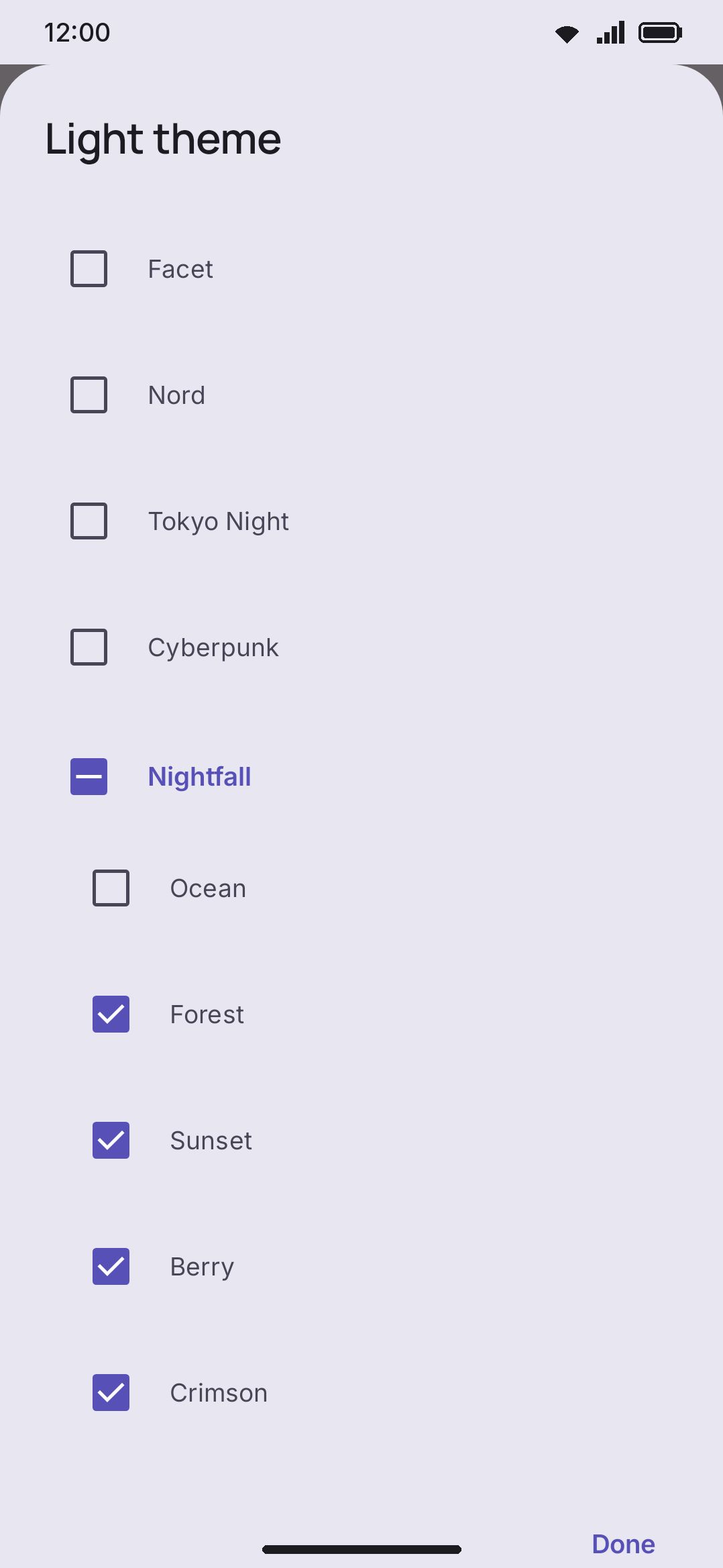
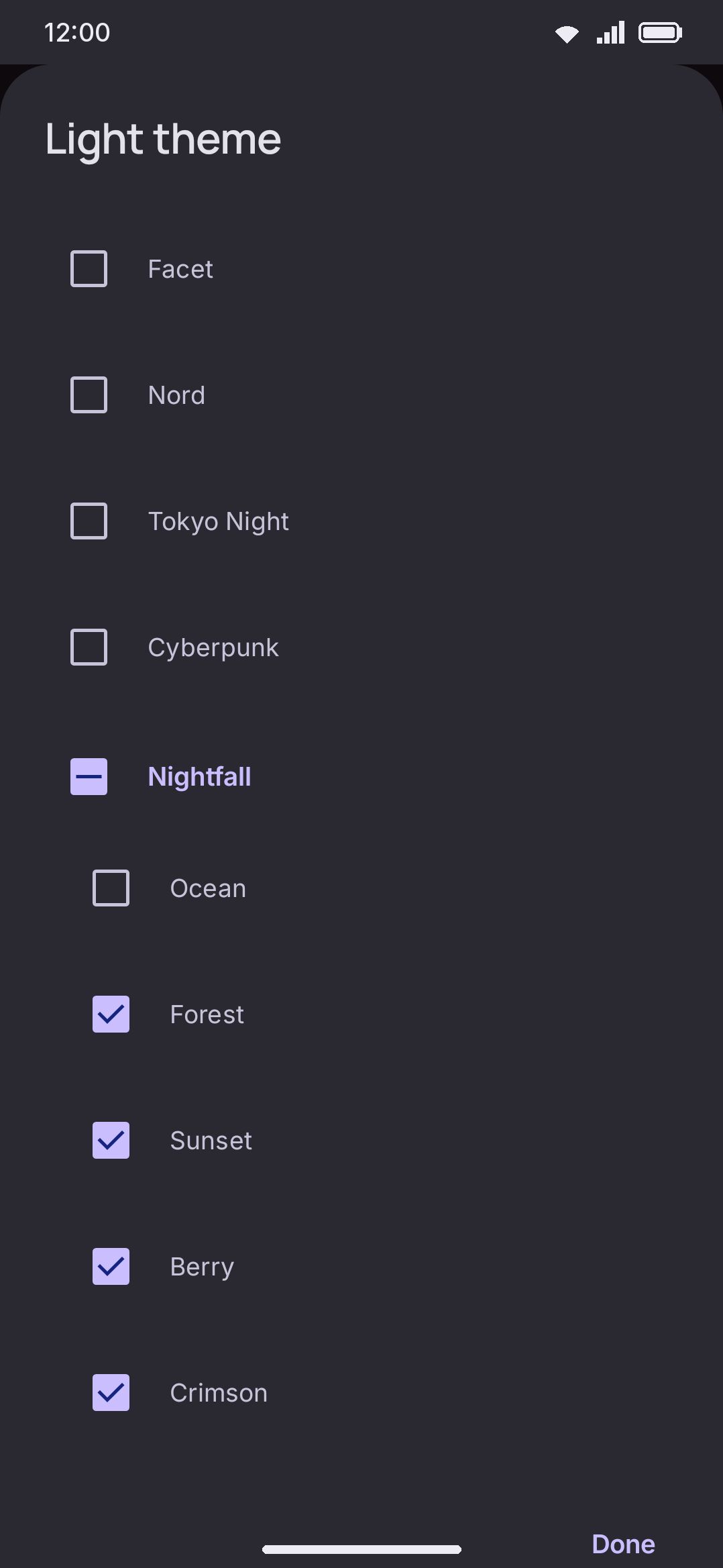
Section titled “One theme, or a set”Each half of the pair holds either one theme or a whole set to select from. Open the Light theme or Dark theme row and the picker opens on a two-way control: One theme, which is the original behaviour and still the default, or Random, which turns the list into checkboxes so you can tick as many as you like. Press a family’s name to tick every look in it at once. The two halves are independent, so a fixed light theme and five rotating dark ones is a perfectly ordinary setup.
Switching to Random ticks the theme that half already showed, and the last ticked theme cannot be unticked, so a random half always has something to show. Switching back to One theme keeps the set, ready for when you turn it on again.
A Change the theme row appears once either half is random, and it decides how often a new theme comes up: every time the keyboard opens, every hour, every 6 hours, every day, every week, or only when you press Change. The theme never changes while you are typing. A new one is selected as the keyboard comes up for a new field, and the same theme stays for the whole session, so nothing moves under your hands mid-sentence. The next theme is never the one already showing, which is what makes the change worth having on a set of two or three.
Options
Section titled “Options”- Material You colors (default off). Wallpaper-based dynamic color for the Default theme and the settings app, in place of the app’s own indigo palette. It does nothing below Android 12, and nothing to built-in or custom themes. Those have their own Follow wallpaper colors switch in the theme editor.
- Mode (default System). System, Light, Dark, or AMOLED, applied to the settings app and the Default theme.
- Auto theme (default off). Once on, pick a light theme, a dark theme, and a trigger (System light or dark, Time of day, or Sunrise and sunset). The time-of-day picker starts at 7:00 AM for the light theme and 7:00 PM for the dark theme.
- Light theme and Dark theme (default One theme, Default (system) in both). Each row opens a picker that holds one theme or a set to select from at random.
- Change the theme (default Every time the keyboard opens). Only shows while a half is random. Every time the keyboard opens, every hour, every 6 hours, every day, every week, or only when you press Change.
- Change the theme now. Selects a new theme for every random half straight away. This is the only way a new theme comes up under the Change-only setting.
Switching themes crossfades over about a third of a second, by hand or under Auto. Turning on Reduce motion (under accessibility) skips the crossfade and snaps instead.
Details & edge cases
Section titled “Details & edge cases”- Contrast is worked out, not guessed. A theme only has to specify seven colors: board, key background, key text, modifier key background, enter key background, enter key icon, and accent. Everything else (popup colors, panel chip colors, tool-circle tints, the pressed face, the gesture trail) is derived from those, using WCAG-style contrast math. That’s why a custom theme built from one seed colour still has readable popups and legible active-tool highlights. The Default theme’s dark mode goes further and steers clear of Material’s own dark surface roles, which tend to flatten to near-identical grays. It blends the theme’s text color over the darkened board at a few different strengths instead, which keeps panels and keys distinct.
- That’s separate from the accessibility contrast tools. High contrast keys, key outlines, and color vision filters are a user-facing layer that overrides theme colors outright rather than filling in gaps. They live under Settings → Accessibility, not here. See Accessibility for those.
- Key shape is a per-theme setting with thirteen options, picked from a list that draws each shape beside its name: None (no shape at all, so only the labels show), Rounded (the default, and the one that follows the corner-radius value), Square, Pill, Cut (clamped to a 2–14dp radius regardless of the slider), Squircle, Arch, Leaf, Slanted, Hexagon, Scalloped, Ticket, and Circle (a typewriter-style round cap centred in the key). Apart from None, everything except Rounded and Cut sizes itself off the key instead of the radius slider. Full table on the theme editor page.
- Corner radius has a global slider and an optional per-theme override. The global Key corner radius slider (Appearance → Keys, default 8dp, range 0–28dp) applies unless a theme defines its own. The theme editor’s “Corner radii for this theme” toggle exposes separate sliders for key, popup, and tool-circle radius when you want a theme to ignore the global value.
- Borders are opt-in and off by default. A theme has no key border unless it sets one explicitly. The built-in Solarized Dark and Solarized Light themes show when a border earns its keep: their two background tones sit close enough in contrast that a thin outline keeps key edges readable. The toolbar tools have their own outline pair in the theme editor, off in the same way. The accessibility “Key outlines” toggle adds a border of its own to the keys and the tools, but only where the active theme hasn’t already defined one. A theme’s own border always wins.
- No edition split. Nothing on this page is gated: every built-in theme, gradient, animation, background image, and Material You itself works the same way in the full and lite editions.