
Keyboard themes
Every row on the theme list and the theme editor: mode, auto light/dark, and every color, shape, and animation control.
Two screens live behind Keyboard themes. One is a gallery for picking, creating, and managing themes. The other is an editor for building one from scratch. This page is the field reference for both. For the reasoning and the bigger picture, read Theming overview and Theme editor instead.
Theme list
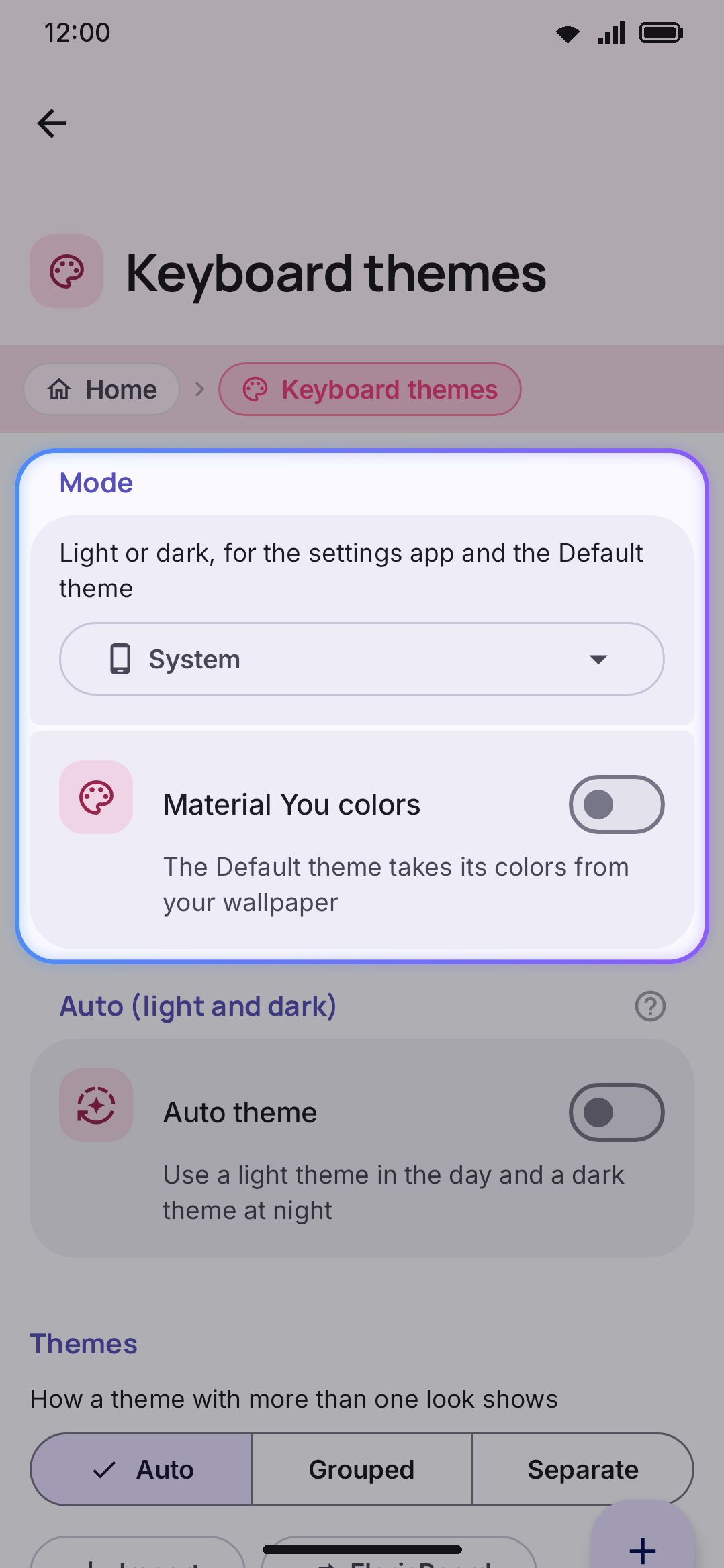
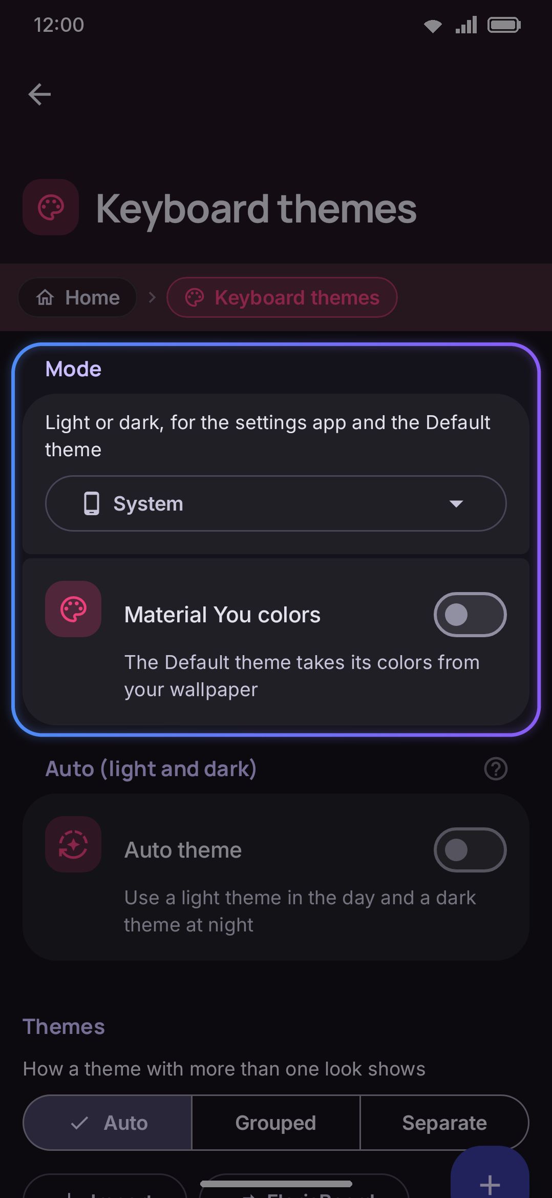
Section titled “Theme list”Reach it from Appearance → Style → Keyboard themes, or by searching “themes” in settings search. The whole screen is one scroll, in three groups.
| Setting | Control | Options | Default |
|---|---|---|---|
| Mode | Segmented row | System / Light / Dark / Amoled | System |
| Material You colors | Toggle | On / Off | Off |
Both apply to the settings app itself and to the Default (system) theme only. Every built-in and custom theme carries its own fixed palette regardless of either setting. Amoled always renders dark, and it forces the Default theme’s board to pure black. System instead waits on the phone’s own light/dark setting.
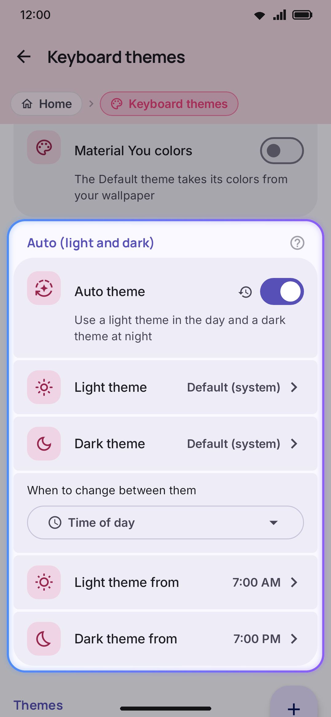
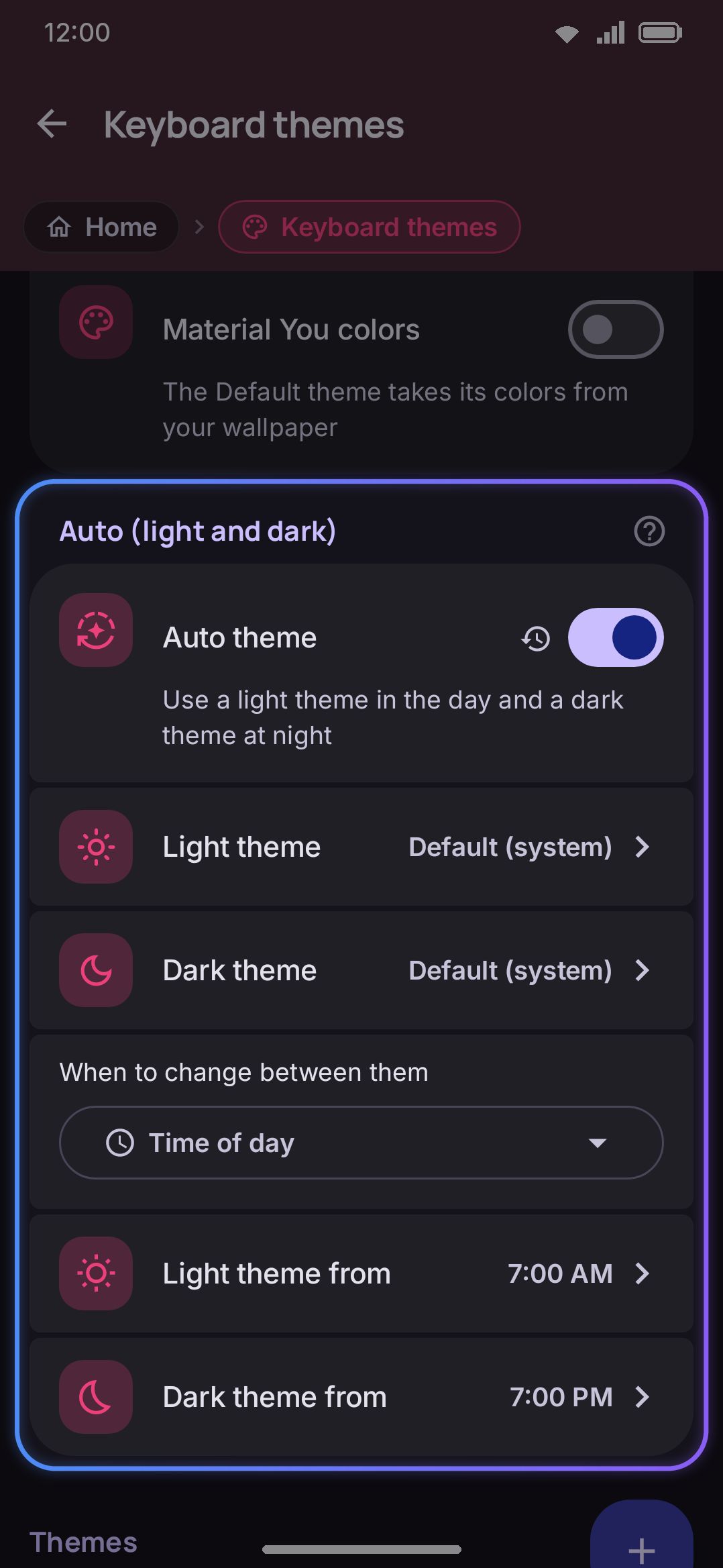
Auto (light + dark)
Section titled “Auto (light + dark)”| Setting | Control | Options | Default |
|---|---|---|---|
| Auto theme | Toggle | On / Off | Off |
| Light theme (shown only while Auto theme is on) | Picker row | Default, any built-in, or any custom theme | Default (system) |
| Dark theme (same) | Picker row | Default, any built-in, or any custom theme | Default (system) |
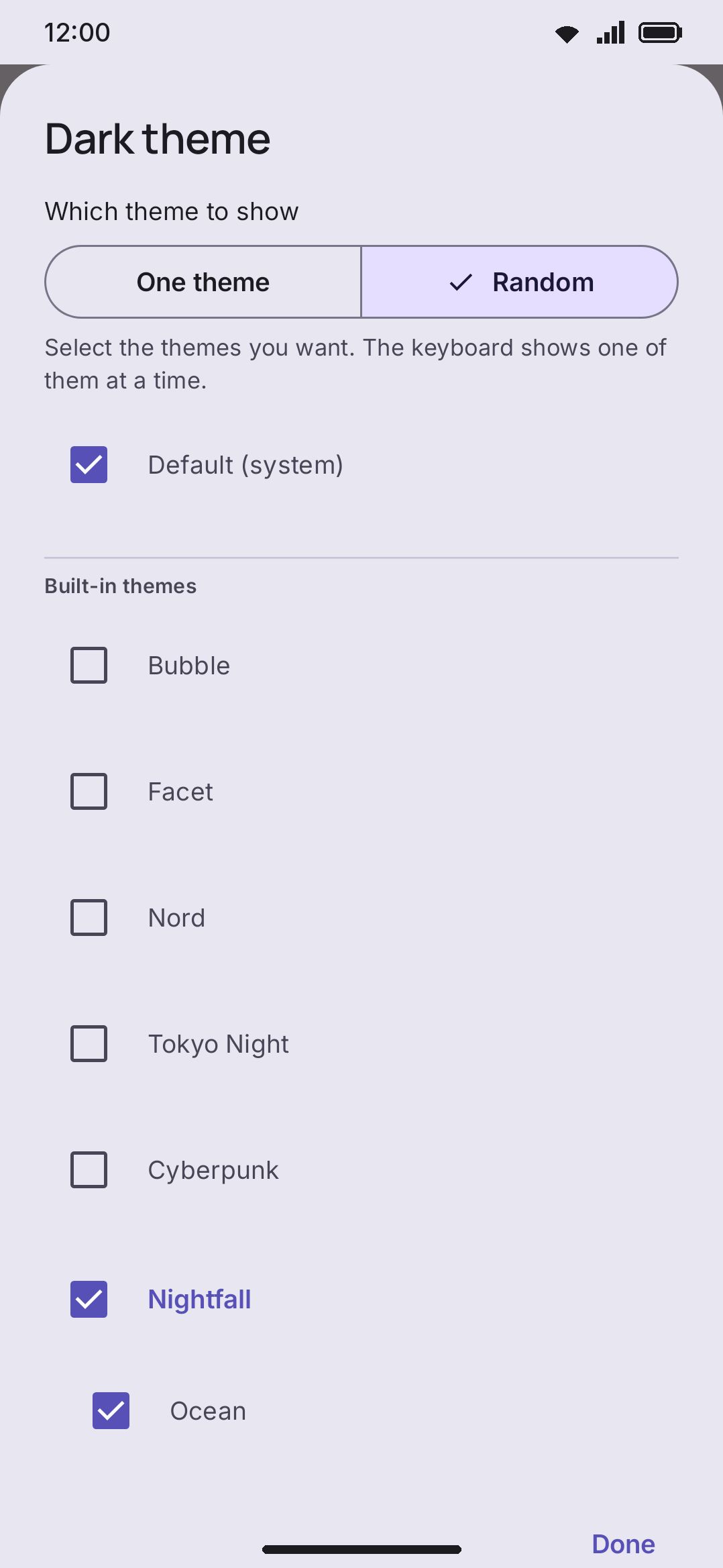
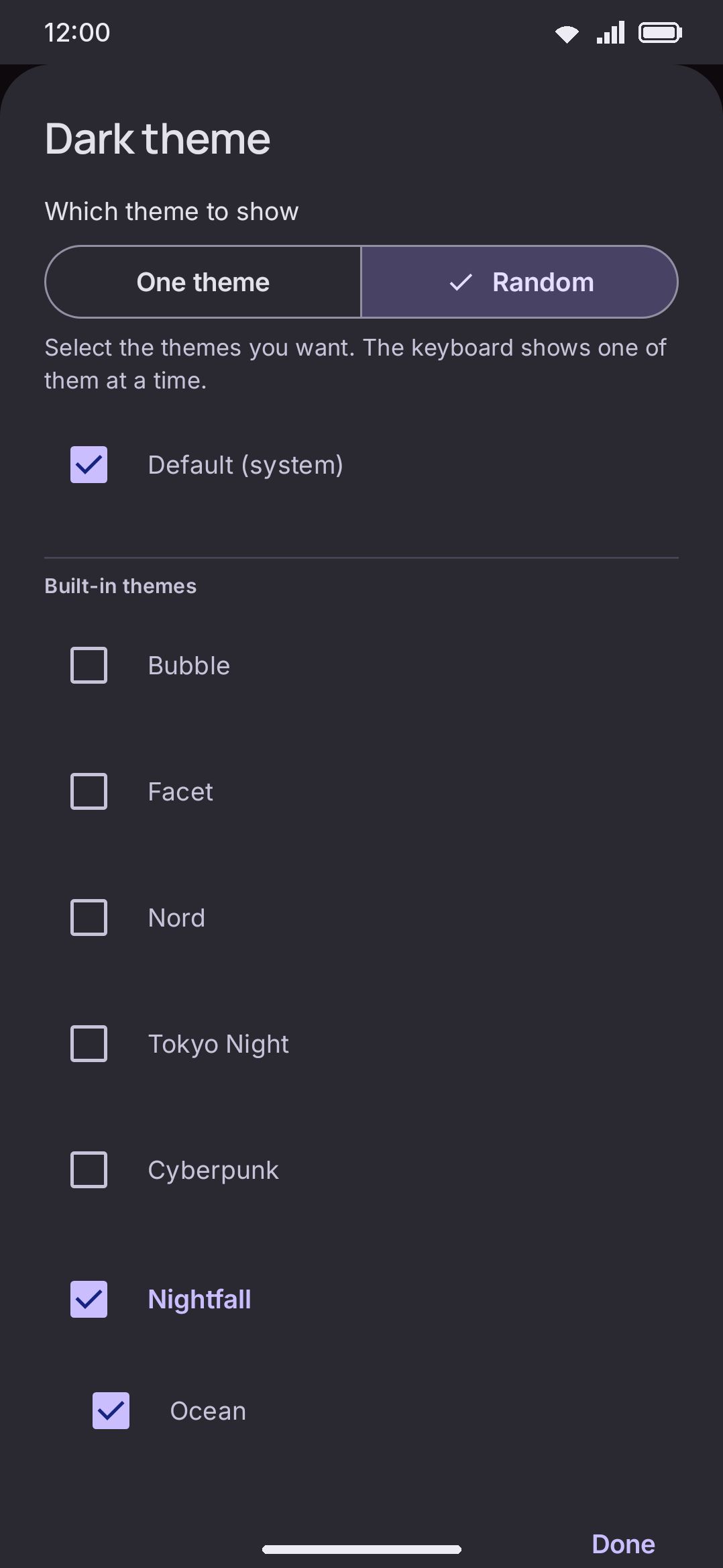
| One theme / Random (inside each picker) | Segmented row | One theme / Random | One theme |
| The theme set (Random only, inside each picker) | Checkbox list | Any number of themes, at least one | The theme that half already showed |
| Change the theme (shown only while a half is Random) | Segmented row | Every time the keyboard opens / Every hour / Every 6 hours / Every day / Every week / Only when I press Shuffle | Every time the keyboard opens |
| Change the theme now (same) | Button | Selects a new theme for every random half | |
| Trigger (same as Light theme) | Segmented row | System light/dark / Time of day / Sunrise & sunset | System light/dark |
| Light theme from (Time of day only) | Time picker | Any clock time | 7:00 AM |
| Dark theme from (Time of day only) | Time picker | Any clock time | 7:00 PM |
Sunrise & sunset shows explanatory text instead of a control. It reads the location already saved in the weather tool and works the times out locally, with no network call. With no location saved, it falls back to System light/dark. While Auto theme is on, the Themes grid below still shows which card is selected, but tapping one only previews it. A note above the grid says so.
Each half of the pair is independent: one can hold a single theme while the other selects from a set. A random half shows how many themes it selects from in place of a theme name. The picker’s list is the same either way, with radio buttons for One theme and checkboxes for Random, and a checkbox on each family name that ticks or unticks every look in it.
Themes
Section titled “Themes”| Setting | Control | Options | Default |
|---|---|---|---|
| Theme gallery style | Segmented row | Auto / Grouped / Separate | Auto |
Grouped draws a theme that has more than one look as a single card with a dot per look. Separate gives every look its own card. Auto reads your answer to the setup wizard’s “how much do you want to tweak” question: “keep it simple” gets Separate, and every other answer (including never having answered) gets Grouped. A caption above the control says which way it’s currently resolving. See Theme families and looks.
| Control | What it does |
|---|---|
| Create theme | Makes a new custom theme named “My theme”, seeded from the first swatch in the theme editor’s color row, generated dark or light to match what your phone is showing right now, sets it active, and opens the editor on it right away |
| Import | Opens a file picker for a theme file, adds it to Your themes under a fresh id, and switches to it immediately (the editor doesn’t open) |
| FlorisBoard | Reads a FlorisBoard .flex theme file and converts it into a custom theme. See Importing other keyboards |
| Gboard | Asks Open a file (a Gboard theme .zip or an Rboard pack) or Browse Rboard (the Rboard collection, fetched from GitHub only when that screen opens; not in the Google Play build, where the button opens the file picker). Each theme is previewed with what did not come across, then saved without being switched on. See Gboard themes and Rboard packs |
| Card tap | Applies that theme to the keyboard immediately. On a family card, tapping a dot applies that look and turns the card’s preview to it |
| Card pencil (custom theme) | Opens that theme in the editor |
| Card pencil (built-in theme) | Copies the built-in into a new custom theme named “(name) copy”, makes the copy active, and opens the editor on the copy (the original is untouched) |
| Card pencil (built-in family) | Asks Make a copy first: Only this look copies the look the card is showing, All looks copies the whole family |
| Card pin (built-in cards only) | Adds or removes that look from the keyboard’s Appearance tool shortlist. Six built-ins are pinned on a fresh install: Ocean, Pitch black, Snow, Nebula, Sunset drift, Aurora |
| Card export | Saves a .wmtheme.json file named after the theme, with any background image embedded as base64. A grouped card exports the whole family; a separate card exports just the one look |
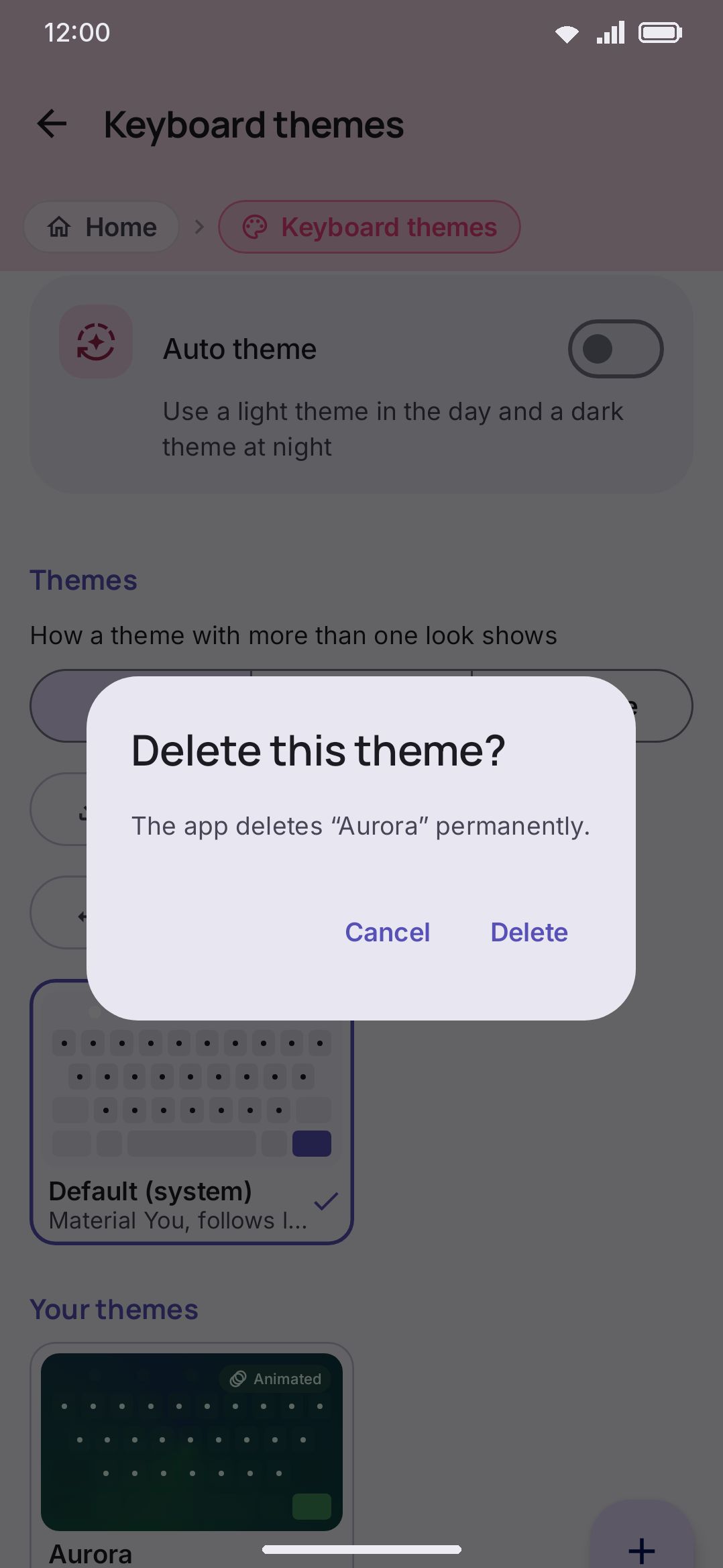
| Card delete (custom themes only) | Confirms first, then removes the theme. Its background and texture images are swept off disk once nothing else still points at them, since looks and family copies share image files. Deleting a variant’s own card (Separate style) removes just that look and falls the selection back to the family; deleting a family card, or the first look’s card, removes the whole family and falls back to Default |
The grid runs two cards per row. Default (system) comes first, with no edit, export, or delete, since it’s generated live rather than stored. Then Your themes, which only shows once you have at least one. Then Built-in, under its own note: “Press a theme to use it. The pencil icon makes a copy that you can edit.” Built-in cards never show a delete button. A second caption explains the pin: your own themes always show in the Appearance tool, built-ins only when pinned.
There are 29 built-in themes: 19 original WM Keyboard designs, plus 10 ports of well-known editor colour schemes (Dracula, Alucard, Nord, Solarized Dark, Solarized Light, Catppuccin Mocha, Catppuccin Latte, Catppuccin Frappé, Catppuccin Macchiato, Tokyo Night). Cyberpunk sits with the ports in the source but isn’t one: it’s ours, and it’s the theme that uses the whole feature set at once (animated board gradient, cut keys, translucent faces, neon outline). Twenty-four of the 29 sit in six families (Nightfall, Pastel, Gradients, Dracula, Solarized, Catppuccin), so the grouped grid shows eleven built-in cards. See Theming overview for the full list and what each one showcases.
Theme editor
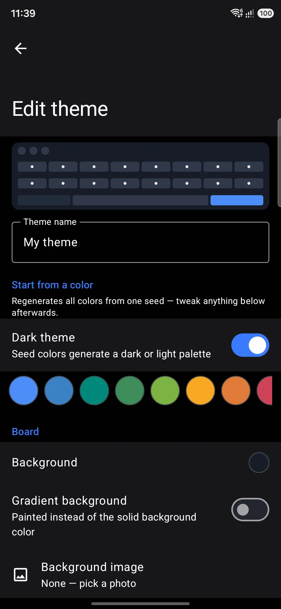
Section titled “Theme editor”Every field here writes and applies the instant you touch it, so there’s no save step. A live keyboard preview is pinned at the top and redraws on every change. The gradient animation holds still in that preview. You only see it move on the real keyboard.
| Control | What it does | Shown when |
|---|---|---|
| Look chips | One chip per look; tapping one points the whole editor below at that look | Always (a one-look theme shows one chip) |
| Add look | Copies the open look into a new one and switches to it | Until the theme has twelve looks beyond the first |
| Delete this look (bin icon) | Confirms, then removes the open look and reopens the first one | While a look other than the first is open |
| Group name | Text field for the label the gallery card shows over the dots | Once the theme has more than one look |
Everything below this row edits the open look alone. See Theme families and looks.
Theme name and start-from-a-color
Section titled “Theme name and start-from-a-color”| Setting | Control |
|---|---|
| Theme name | Text field |
| Dark theme | Toggle (regenerates the palette as a dark or light set) |
| Seed swatch row | 15 tappable colors |
| Follow wallpaper colors | Toggle, off (on for a FlorisBoard theme written in Material You colors). Needs Android 12 or later |
Tapping a swatch, or flipping Dark theme, reseeds every seed-derived color at once (board, keys, accent, popups) while leaving hand-edited fields, gradients, the background image, key shape, border, and animation untouched.
Follow wallpaper colors moves the theme’s colors onto the wallpaper’s palette as the keyboard draws them. The stored colors don’t change. See following your wallpaper for how each kind of theme is mapped.
WM KeyboardAppearanceKeyboard themes(edit a theme)Board| Setting | Control | Default |
|---|---|---|
| Background | Color, alpha | #17181C |
| Gradient background | Gradient, off by default | Off |
| Background image | Opens Select a background | None |
| Crop image (image set) | Opens the crop dialog | n/a |
| Image opacity (image set) | Slider, 0–100% | 100% |
| Image blur (image set) | Slider, 0–25 | 0 (off) |
| Play animated image (image set) | Toggle | On for a GIF or animated WebP, off otherwise |
| Landscape background image | Opens Select a background, always shown | None |
| Crop landscape image (landscape image set) | Opens the crop dialog | n/a |
| Photo credit (service photo set) | Opens the photographer’s page | n/a |
| Rotating background (collection not empty, or rotation on) | Opens Rotating background | Off |
| Photo services (own key set, or a service photo kept) | Opens the service keys screen | n/a |
Select a background offers four choices: Add from this device (the system photo picker), Find a photo online (Unsplash and Pexels), Photo collection, and Remove when the slot already has an image.
Applying a background zeroes the board color’s alpha and drops fully opaque key and modifier colors to about 62%, so the photo is visible rather than covered by solid keys; both stay editable afterward. Keys you had already made see-through are left alone.
The landscape image row is independent: it’s shown even with no portrait image set, falls back to the portrait image (or the plain background color) when empty, and lets a portrait photo and a wide crop each fit their own orientation instead of one being stretched into the other.
Play animated image plays a GIF or animated WebP background instead of freezing it on frame one. Picking one turns the switch on for you, so a GIF from your gallery moves without your having to find this row; picking a still, or cropping the animation away, turns it back off. It and the blur slider exclude each other. Turning the switch on zeroes the blur, and raising the blur turns the switch off, because blurring a running animation re-renders it every frame. The animation also holds still under reduce motion and power saving.
The last two rows stay hidden until you have started using photos, so a theme with one gallery picture never shows them. Full walkthroughs: Image backgrounds and Online photos and rotation.
| Setting | Control | Default |
|---|---|---|
| Key shape | Row → picker dialog: None / Rounded / Square / Pill / Cut / Squircle / Arch / Leaf / Slanted / Hexagon / Scalloped / Ticket / Circle | Rounded |
| Letter keys | Color, alpha | #303338 |
| Key gradient | Gradient, off by default | Off |
| Key text | Color | #E9E9EE |
| Modifier keys | Color, alpha | #222428 |
| Modifier key text | Color, alpha off, Auto → Key text | Auto |
| Key hint text | Color, alpha, Auto → the key’s own text color at 55% opacity | Auto |
| Enter key | Color | #4C8DF6 |
| Enter key icon | Color | #0B1220 |
| Pressed key | Color, Auto → blended from Letter keys and Accent | Auto |
| Key border | Color, Auto → no border | Auto |
| Border width (border color set) | Slider, 0–3dp | 0dp |
The Key shape row opens a dialog rather than filling a segmented row. Twelve names don’t fit side by side, and a name on its own doesn’t tell you much. So each row of the dialog draws the shape at key proportions and at this theme’s corner radius. Rounded and Cut both follow the corner-radius value (global or per-theme, see Corners), but Cut clamps its own radius to 2–14dp regardless of the slider. The other ten size themselves off the key’s own width and height, and ignore the slider. Shape descriptions are on the theme editor page. Setting a key border color alone shows no visible border until you also raise Border width above 0.
Key textures
Section titled “Key textures”| Setting | Control | Default | Shown when |
|---|---|---|---|
| Letter keys | Picks an image from the gallery | None | Always |
| Modifier keys | Same | None | Always |
| Enter key | Same | None | Always |
| Space bar | Same | None | Always |
| Pressed keys | Same | None | Always |
| Key preview popup | Same | None | While Key popup is on |
| Crop / Stretch / Tile | Segmented row | Crop | Any slot has an image |
| Texture opacity | Slider, 10–100% | 100% | Same |
Six slots when Key popup (under Key press) is on, five without it, one image each, drawn over the key colour and clipped to the key shape. One picture in Letter keys is enough to theme the board: the other slots fall back to it or to plain colour rather than sitting empty. Each image is stored downscaled to 512px. A row with one set shows it as a thumbnail, with a bin icon to clear it. Textures travel inside an exported theme.
Single-key styles
Section titled “Single-key styles”| Control | What it does |
|---|---|
| Add a key | Dialog: type a letter, or pick one of Enter, Space, Shift, Delete, Symbols, Emoji, Languageswitch (the globe key) |
| A key’s row | Opens that key’s own style sheet, below |
| Bin icon | Drops the whole override for that key |
A key’s sheet:
| Control | What it does |
|---|---|
| Key background, Key text, Key hint text, Key border | This key’s own colours; Auto follows the theme |
| Popup background, Popup text | Its preview bubble’s colours. Hidden while key popups are off |
| Key image | A picture for this one key, drawn at the theme’s texture fit and opacity. Bin icon clears it |
| Press effect | Automatic, Stars, Hearts, Sparkle, Confetti, Emoji (with its own emoji field). Hidden under reduce motion |
| Bold label | Automatic / Off / On |
| Label size | Switch to set one, then a slider from 30% to 200% of a letter’s size |
A letter’s style follows that letter onto every layout that has it. Anything you leave unset keeps following the theme, and an armed or locked modifier still shows the accent or pressed face whatever colour you gave it. A label size the layout gave the key in the layout editor beats the theme’s.
Stickers
Section titled “Stickers”| Setting | Control | Range | Default |
|---|---|---|---|
| Add a sticker | Picks an image from the gallery | Up to 6 | None |
| Position, across | Slider | 0–1 (fraction of the grid’s width) | 0.5 |
| Position, down | Slider | 0–1 | 0.5 |
| Size | Slider | 0.05–0.8 (fraction of the grid’s width) | 0.25 |
| Rotation | Slider | -180° to 180° | 0° |
| Opacity | Slider | 10–100% | 100% |
Purely decorative images laid over the keys. The layer takes no touches, so typing goes straight through. You adjust each sticker’s five sliders over a live miniature of the board. Positions are fractions of the key grid rather than pixels, so a sticker keeps its place across widths and orientations.
Accent & popups
Section titled “Accent & popups”| Setting | Control | Default |
|---|---|---|
| Accent | Color | #8AB4F8 |
| Gesture trail | Color, alpha, Auto → Accent | Auto |
| Popup background | Color, alpha, Auto → computed scrim | Auto |
| Popup text | Color, Auto → Key text | Auto |
| Popup shape | Row → the same picker dialog Key shape uses | follows WM KeyboardKey pressKey popupPopup shape |
| Popup placement | Segmented row: Default / On the key / Floating | Default (follows WM KeyboardKey press) |
| Popup outline | Color, Auto → no outline | Auto |
| Popup outline width (outline color set) | Slider, 0–3dp | 0dp |
| Menu shape | Row → the same picker dialog | Automatic (a safe derivative of Popup shape) |
Accent drives the shift-on tint, the active-tool highlight, and buttons across the panels. Popup shape covers every popup surface, from the character bubble to the long-press alternates, the language list, and the panel menus. Menu shape is the exception. On Automatic, the list menus take Popup shape only when it’s one of the four plain outlines (Rounded, Square, Cut, Squircle), and fall back to Rounded otherwise, since a slanted or scalloped menu clips its own rows. Picking a shape here overrules that.
Toolbar
Section titled “Toolbar”| Setting | Control | Default |
|---|---|---|
| Tool background shape | Row → the same picker dialog Key shape uses | follows WM KeyboardAppearanceToolbarTool background shape |
| Tool icons | Color, Auto → Key text at partial opacity over the board | Auto |
| Tool circles | Color, alpha, Auto → computed | Auto |
| Active tool circle | Color, alpha, Auto → same formula as Pressed key | Auto |
| Tool outline | Color, alpha, Auto → no outline | Auto |
| Tool outline width (outline color set) | Slider, 0–3dp | 0dp |
Panels & suggestions
Section titled “Panels & suggestions”| Setting | Control | Default |
|---|---|---|
| Cards & search bar | Color, alpha, Auto → Modifier keys | Auto |
| Suggestion text | Color, Auto → Key text | Auto |
“Cards & search bar” covers suggestion chips and the search bar surface across the tool panels.
Any row still on Auto shows an “Auto” label instead of a swatch; once you override it, its color picker gains an Auto button next to Apply that clears the override again. See Theme editor for the exact fallback formula behind every Auto field.
Chips & buttons
Section titled “Chips & buttons”| Setting | Control | Default |
|---|---|---|
| Chip text | Color, Auto → Modifier key text, then Key text | Auto |
| Selected chip | Color, alpha, Auto → Active tool circle | Auto |
| Selected chip text | Color, Auto → Accent | Auto |
| Chip outline | Color, Auto → no outline | Auto |
| Chip outline width (outline color set) | Slider, 0–3dp | 0dp |
| Chip shape | Row → the same picker dialog Key shape uses | Rounded |
| Chip corner radius (Rounded or Cut only) | Slider, 0–24dp | 12dp |
| Card shape | Row → the same picker dialog | Automatic (a safe derivative of Chip shape) |
Chips are the small tappable surfaces inside the tool panels: style pickers, tab strips, converter controls, search bars, and the buttons a plugin draws. Their background is the Cards & search bar colour above, and this group styles the rest of them. The radius slider only appears for the two shapes that read a radius. Card shape follows the same safety rule as Menu shape, so the bigger surfaces fall back to Rounded when the chip shape is a decorative one.
The panels’ own keypads are keys rather than chips (calculator, numpad, the converters, the text-editing pad), so they follow the theme’s key shape and key border instead.
Corners
Section titled “Corners”| Setting | Control | Range | Default when enabled |
|---|---|---|---|
| Theme-specific corner radii | Toggle | On / Off | Off |
| Key corner radius (on) | Slider | 0–28dp | seeded from WM KeyboardAppearanceKeysKey corner radius (8dp) |
| Popup corner radius (on) | Slider | 0–40dp | seeded from WM KeyboardKey pressKey popupPopup corner radius (12dp) |
| Tool circle radius (on) | Slider | 0–20dp, “off” at 0 | seeded from Appearance → Toolbar → Tool circle radius (20dp) |
Off by default, so a theme follows the three global sliders: two under Appearance, and the popup one under Key press. Turning the switch on seeds all three radii from their global counterparts at once, and turning it off clears all three back to following the globals again.
Layout
Section titled “Layout”| Setting | Control | Range | Default when enabled |
|---|---|---|---|
| Layout for this theme | Toggle | On / Off | Off |
| Tool background width (on) | Slider | 38–64dp | your current global value |
| Toolbar height (on) | Slider | 32–80dp | your current global value |
| Popup height (on) | Slider | 32–160dp | your current global value, one per bubble style |
| Key height (on) | Slider | 32–100dp | your current global value |
| Key spacing (on) | Slider | 0–2× | your current global value |
| Left padding (on) | Slider | 0–30% | your current global value |
| Right padding (on) | Slider | 0–30% | your current global value |
| Key label font size (on) | Slider | 0.7–1.5× | your current global value |
| Bold key labels (on) | Toggle | On / Off | your current global value |
| Key hint font size (on) | Slider | 0.5–2× | your current global value |
| Gesture trail width (on) | Slider | 2–24dp | your current global value |
| Gesture trail opacity (on) | Slider | 10–100% | your current global value |
A second opt-in group, off by default. One switch seeds every value in the group from your current global settings, and turning it off clears them all again. A theme either carries its own sizes or carries none of them. Each row is named after the global row it takes over, so the switched-off global row can send you here by name. Screen-specific sizes from Layout settings (folded, unfolded, landscape) still win over a theme’s own.
Popup height is the height of the key-preview bubble. The global slider keeps one value for the on-key bubble and another for the floating one, and the theme stores the same pair, seeded from both global values at once. The slider shows the height of the style the theme is drawing: its own placement if it sets one under Popups, otherwise the global Popup on key switch. A drag changes that style’s height only.
Animation
Section titled “Animation”This whole section, heading included, is hidden while Reduce motion (under Accessibility) is on, since neither control could change anything the board draws.
| Setting | Control | Options | Default |
|---|---|---|---|
| Animation | Segmented row | None / Flow / Hue cycle | None |
| Speed (not None) | Slider | 0.25×–3× | 1× |
Flow drifts the board gradient along its own axis, or orbits the center for a radial gradient. Hue cycle slowly rotates the hue of the board gradient, or of the solid board color if no gradient is set. Animation only runs while the keyboard is on screen. Three built-ins ship with it on: Sunset drift and Cyberpunk use Flow, and Aurora uses Hue cycle. Every other built-in, and every fresh custom theme, starts on None.
Key press effect
Section titled “Key press effect”This whole section is also hidden while Reduce motion is on, for the same reason.
| Setting | Control | Range | Default |
|---|---|---|---|
| Effect | Segmented row | None / Stars / Hearts / Sparkle / Confetti / Emoji / Images | None |
| Emoji to throw (Emoji only) | Text field, up to 16 characters | Any emoji | Empty |
| Particle images (Images only) | Picks images from the gallery | Up to 6 | None |
| Intensity (any effect) | Slider | 0.4×–2.4× | 1× |
A small particle burst under every key press. With Emoji, each character you type into the field becomes its own particle kind. With Images, each picture does. Transparent PNGs look best. The effect never plays under reduce motion or power saving, and high contrast keys drops it along with the rest of the decoration.
Font and sound
Section titled “Font and sound”| Setting | Control | Default |
|---|---|---|
| Key font | Row → picker of the fonts on this device | Follow settings |
| (a script’s name) font | Row → picker for that script | Only listed for scripts the theme names |
| Add a font for a script | Row → script picker, then a font picker | n/a |
| Key sound | Row → picker of the sounds on this device | Follow settings |
Both are referenced by name, never copied into the theme file. Import a theme without the font or sound installed and it falls back to your own global choice. Key font covers Latin, Cyrillic and Greek only. Every other script keeps its automatic Noto face unless the theme names one for it. The theme sits between your two kinds of pick in WM KeyboardAppearanceKeyboard font: a per-script face you chose yourself beats the theme’s face for that script, and the theme’s own Key font beats your English pick. See Theme editor for the id forms that travel between devices.
Gradients
Section titled “Gradients”The Gradient background (Board) and Key gradient (Keys) rows share one editor. Turning the switch on seeds a default: the board gradient starts as a 135° linear blend from Background to Accent, and the key gradient as a subtle 90° white sheen. A live gradient strip sits above the controls.
| Setting | Control | Range |
|---|---|---|
| Type | Segmented row: Linear / Radial / Sweep | n/a |
| Angle (Linear, Sweep only) | Slider | 0–360° |
| Color stops | 2 to 4 color rows, alpha supported on each | Add color / Remove color |
Cropping an image
Section titled “Cropping an image”
Pinch to zoom, up to 6×. Drag to pan. The image always scales to fill the frame, so there’s never a gap at the edges. Four aspect presets: Keyboard (2.4:1, the default), Wide (1.7:1), Square (1:1), and Free, which takes the picture’s own ratio so nothing is cut. Free is the one for a split or floating keyboard, which is none of the three fixed shapes. Confirming writes a new JPEG and deletes the source file. The crop isn’t reversible from inside the editor, so re-picking the original photo starts a fresh crop.
The color picker
Section titled “The color picker”Tapping any color row opens the same dialog. A split preview strip sits at the top: the color you opened with on the left, the color you have now on the right, and pressing the left half reverts. Below it is a hue and saturation wheel, plus a Brightness bar and, on fields that support alpha, an Opacity bar; a button in the title bar swaps the wheel for separate Hue and Saturation bars, which TalkBack can also read and set. Then a hex field, taking 3, 6, or 8 hex characters (a 6-character value keeps whatever opacity was already set, rather than forcing it opaque), and 21 preset swatches: the 15 seed colors plus 6 grayscale steps from white to black. Apply confirms and Cancel discards. An Auto button appears only on fields that have a fallback and are currently overridden, and it clears the override back to Auto.
Details & edge cases
Section titled “Details & edge cases”- When Auto theme is on, the gallery shows a banner with a Turn off button instead of a note, since picking one theme by hand does nothing until it is off.
- The editor’s sixteen sections are collapsed cards. Tap a header to open it; the state is remembered, and the live preview stays pinned under the title while you scroll.
- No per-row restore buttons on either screen. The app-wide putting one setting back control doesn’t appear here, because a theme is something you built rather than a setting the app shipped a default for. Undo works the way each thing itself works. A colour row goes back with its picker’s Auto button. The two opt-in groups (theme-specific corner radii, layout for this theme) clear by switching the group off. A look, sticker or single-key style goes by deleting it. And the built-in you copied from is still sitting in the gallery if you want to start over.
- Editing an existing custom theme doesn’t switch to it. Opening the pencil on a theme already in Your themes just opens the editor. Only Create, the built-in pencil (duplicate), and Import set the opened theme as active, as a side effect of those specific actions.
- “Landscape background image” is reached only through a specific theme’s editor, not from the gallery screen itself. Its settings-search entry is filed under the gallery’s breadcrumb anyway, because the editor needs a real theme open and search alone can’t supply one.
- Mode, Material You colors, and the Auto trigger picker have no settings-search entry. They’re real rows on the gallery screen, but searching for “Mode” or “Trigger” won’t surface them directly. Search “themes” or “auto theme” instead. Light theme, Dark theme, Change the theme, and Change the theme now are all indexed.
- Deleting a theme takes it out of every set that named it. The half falls back to another theme in its set, or to the single theme it was showing when the set empties. The Random setting itself stays on, so putting a set back together is a matter of ticking themes rather than finding the control again.
- The picker list is sorted, not stored order. Themes that stand alone come before the families in each part of the list, so a theme with no family can never appear directly under a family’s name. Your own themes sit under a heading of their own, sorted by name.
- The last ticked theme can’t be unticked. Its checkbox goes flat rather than clearing the set, because a random half with nothing in its set has nothing to show.
- A random half changes between sessions, never during one. The new theme is selected as the keyboard comes up. Turning the interval down to Every hour does not mean the theme changes while a field is open: it means the next keyboard that opens after the hour is up gets a new one.
- The three corner radii are symmetric with the globals, but the globals aren’t all on one screen. Key corner radius and Tool circle radius come from Appearance. Popup corner radius comes from Key press, which is easy to miss when you’re hunting for it under Appearance with the other two.
- Deleting or exporting is only offered for Your themes. The Default card and every built-in card skip both buttons. A built-in’s pencil makes an editable copy instead of opening it directly.
- Changing the seed keeps a photo visible. A seed swatch or the light/dark switch rebuilds every color. But when the theme has a background image, how see-through the board and keys are carries across rather than resetting to opaque.
- The photo rows are conditional, and so is their settings-search behavior. Rotating background and Photo services are reachable from search whether or not their rows are currently visible in the editor, because search navigates to the screen directly.
- No edition split. Every control on both screens behaves the same on the full and lite editions: colors, gradients, images, corners, animation, photos.
Related pages
Section titled “Related pages”- Theming overview: why you’d pick each mode, the full built-in theme list, and how Auto’s three triggers behave.
- Theme families and looks: family cards, the swatch dots, the Grouped and Separate gallery styles, and building a multi-look theme.
- Theme editor: the guided walkthrough of building a theme, with the exact fallback formula behind every Auto color.
- Image backgrounds: the background-image picker, crop, opacity, and blur controls in full.
- Online photos and rotation: searching Unsplash and Pexels, the photo collection, and the background that changes on a schedule.
- Sharing themes: exporting, importing, and installing a theme from an addon repository.
- Appearance: the Style group Keyboard themes opens from, alongside Keyboard font and Icons.
- Keyboard font and Icons: the two other Style rows, holding the global choices a theme’s own font, key label size and bold-label settings sit on top of. Icon glyphs are the one part of the look a theme has no say over.