Appearance
Keyboard style, key look, and the toolbar's shape.
The Appearance screen is where the keyboard’s look comes together. It’s the hub for the theme, font, and icon pickers, and it holds the sliders that shape the keys themselves and the toolbar above them.
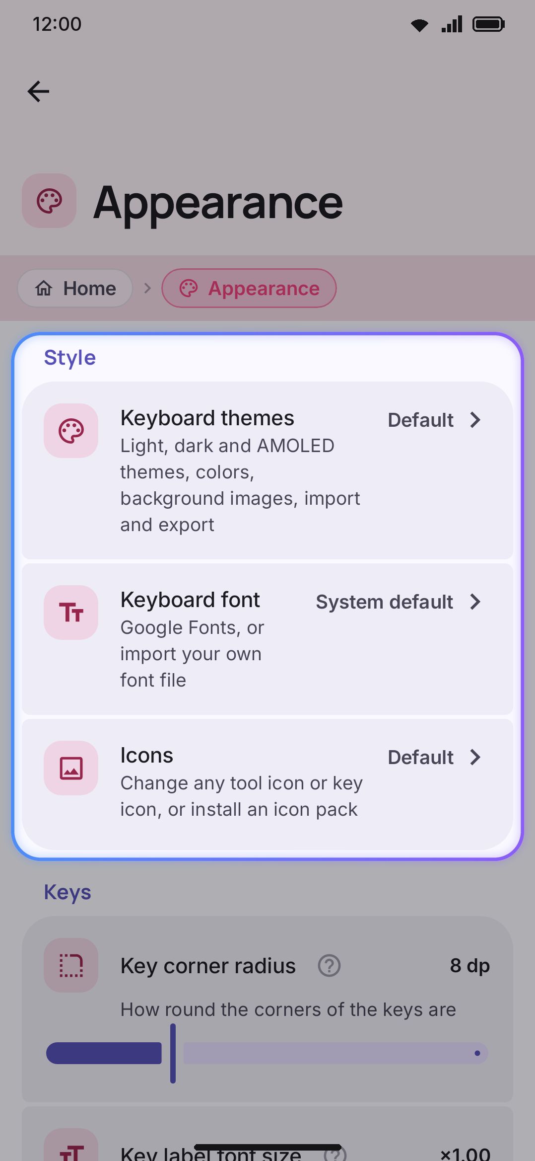
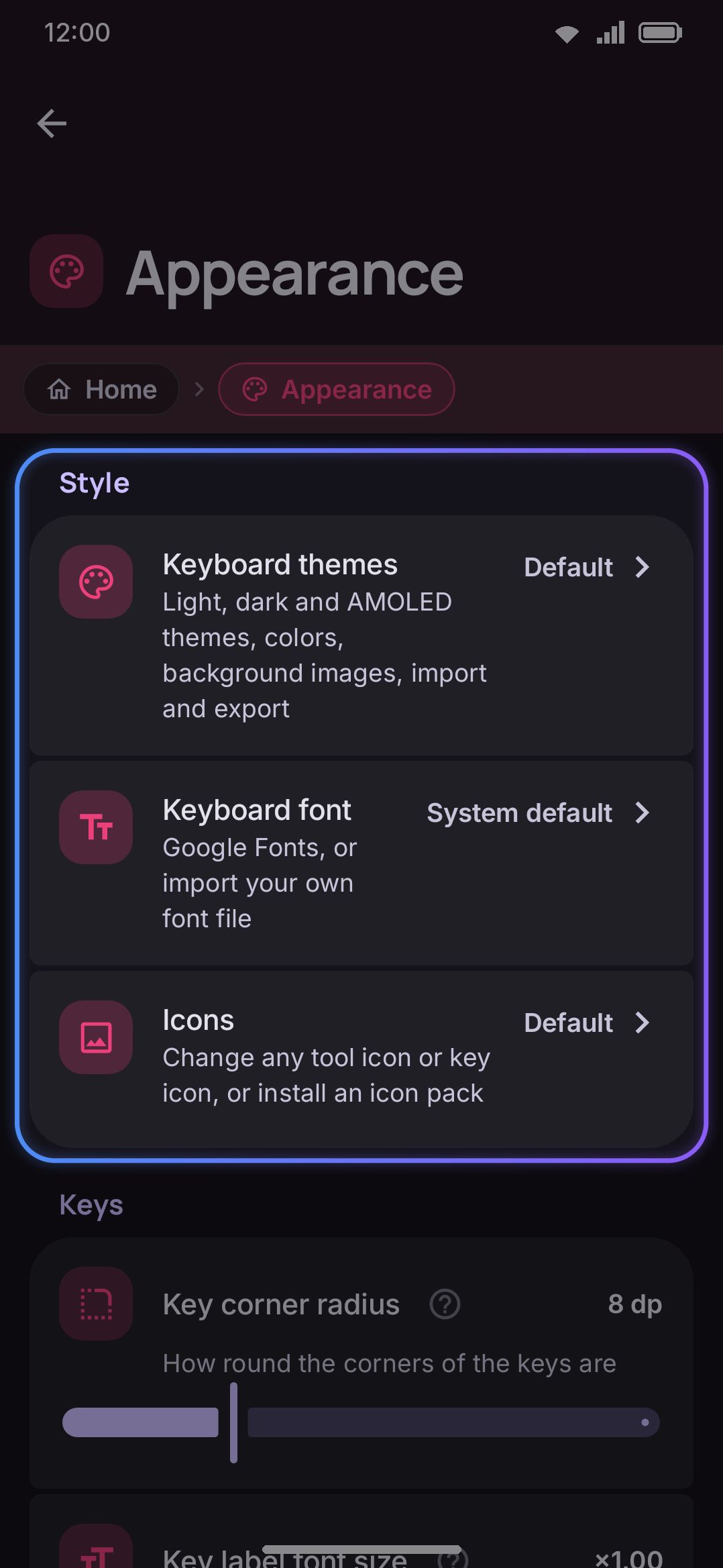
Three rows that each open their own screen rather than settings inline:
- Keyboard themes: light, dark, AMOLED, and custom colors, background images, and theme import/export. Shows the active theme’s name, or “Default” when you haven’t picked one. Full details on Themes.
- Keyboard font: Google Fonts, or a font file you import yourself. Shows “System default” until you pick something else. Full details on Fonts.
- Icons: swap any tool or key icon individually, or install a whole icon pack. Shows “Default” with nothing changed, the active pack’s name once one is installed, or a count of individually-changed icons. Full details on Icon packs.
Reference pages for each of these three screens: Keyboard themes, Keyboard font, Icons.
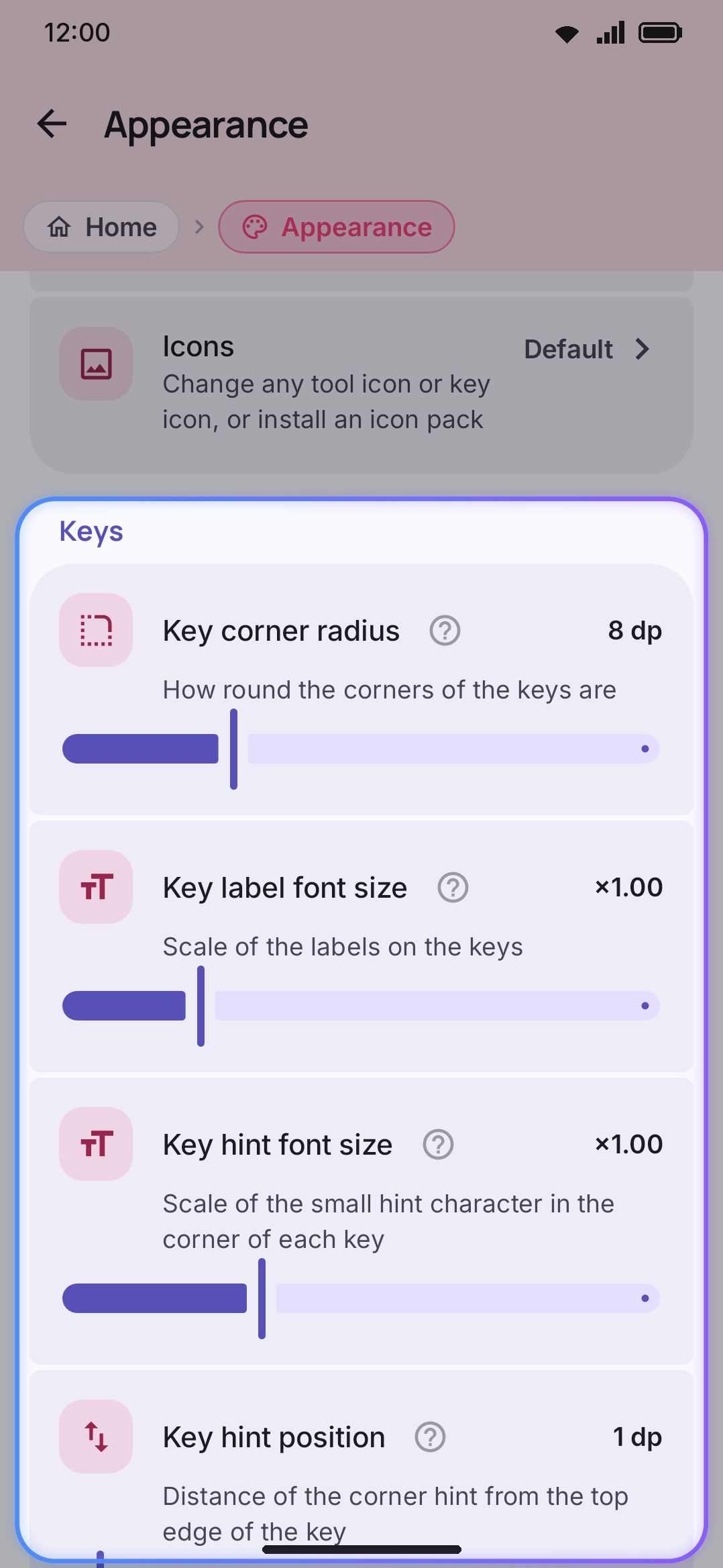
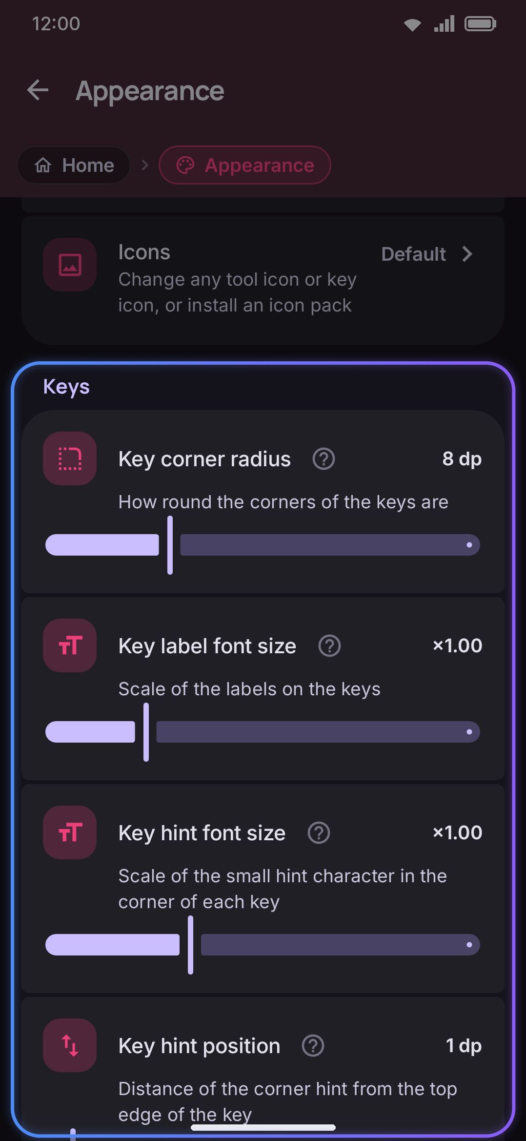
WM KeyboardAppearanceKeysThree sliders that apply to every key, whatever layout is active. All three are the global value, and a theme may override any of them:
| Setting | Range | Default |
|---|---|---|
| Key corner radius | 0–28 dp | 8 dp |
| Key label font size | ×0.7–×2.0 | ×1.00 |
| Key hint font size | ×0.5–×2.0 | ×1.00 |
| Key hint position | 0–16 dp | 1 dp |
Key corner radius goes from square keys at 0 to fully pill-shaped keys at 28. Turn on “Corner radii for this theme” in the theme editor and it seeds that theme’s own key-radius slider from this value. See Themes for how a theme can override it.
Key label font size scales every printed letter on the keys themselves. It’s separate from the popup bubble that appears on a key press, which has its own size under Key press → Key popup.
Key hint font size scales the small corner hint on a key: the character or symbol a long-press on that key types. This slider only controls their size once they’re showing. The “Press and hold hints” toggle that turns the hints on or off in the first place lives on the Key press screen, not here. See Key basics for how long-press hints work.
Key hint position moves that corner hint up or down. At 0 the hint touches the top edge of the key. Raise it to bring the hint down toward the letter.
Toolbar
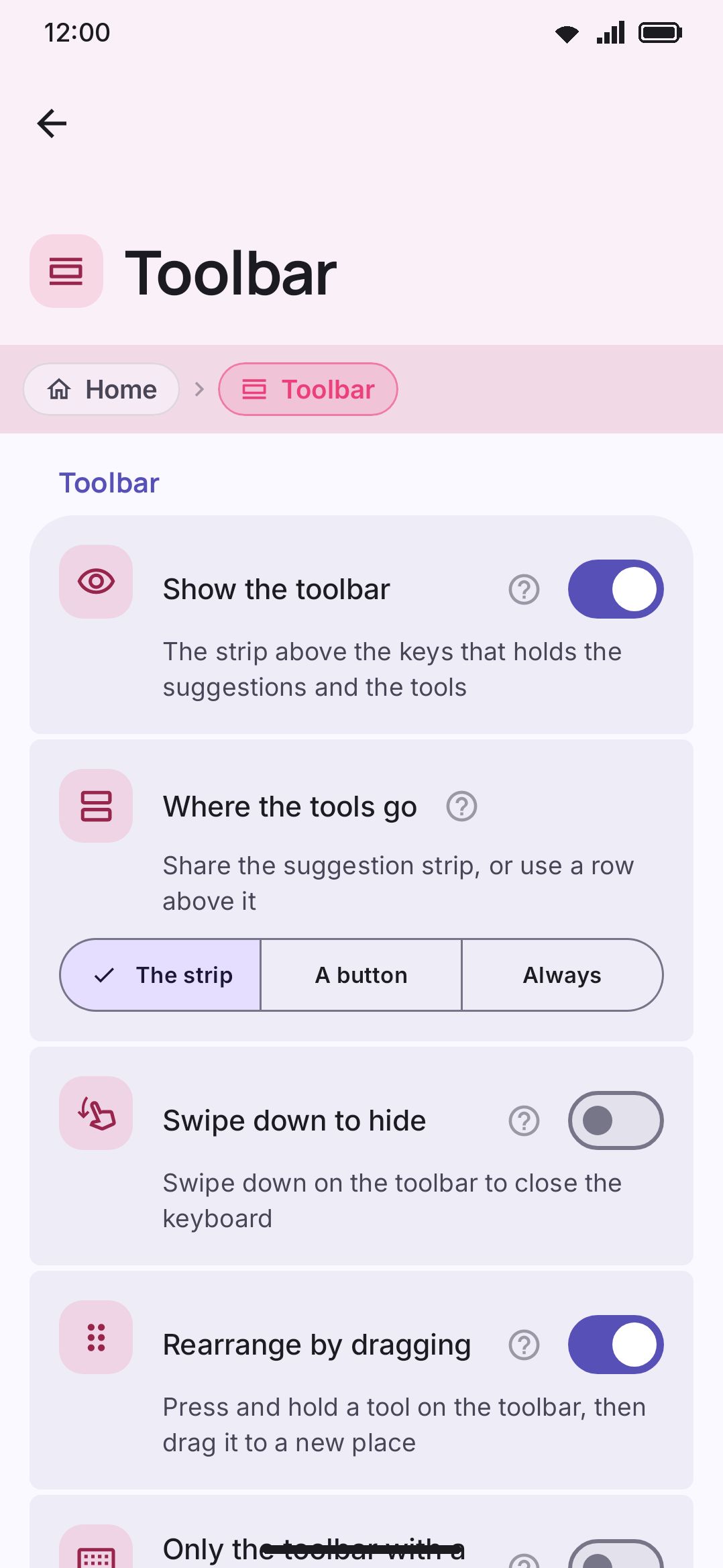
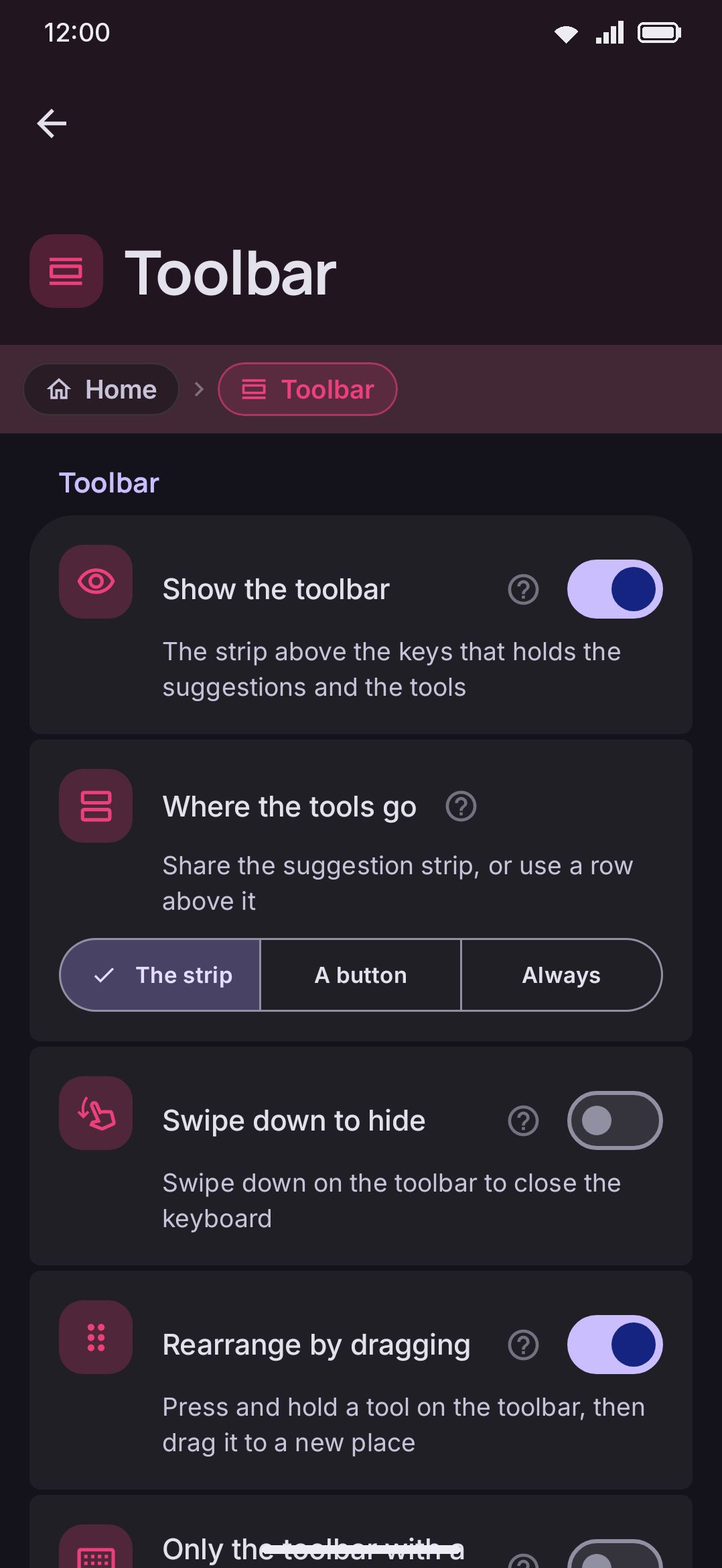
Section titled “Toolbar”The toolbar is the strip above the keys that carries word suggestions while you type and your pinned tools otherwise.
| Setting | Type | Default | Notes |
|---|---|---|---|
| Show the toolbar | Toggle | On | Turning it off reclaims its height for the keys, but also hides suggestions and every pinned tool. You’re asked to confirm before it disables. |
| Where the tools go | The strip / A button / Always | The strip | The strip is the original arrangement: tools and suggestions share one row and the arrow flips between them, so the tools are only in reach when nothing is being suggested. The other two give the tools a row of their own above the suggestions. A button opens and closes that row from the same arrow. Always leaves it open instead. Either way, having the row up costs one row’s worth of keyboard height. Only shown while the toolbar is on. |
| Suggestion strip | Toggle | On | Keeps the suggestion row above the tools row. Turn it off to keep only the tools row and give the suggestion row’s height back to the keys, for example if you’ve turned suggestions off and the row sits empty. It also removes everything else that appears in that row: the paste chip for your last copy, one-time codes, snippet offers and other chips. Voice typing’s compact bar still takes the row while you dictate. Only shown while Where the tools go is set to Always, because with A button the arrow on the suggestion strip is how you open the tools. |
| Swipe down to hide | Toggle | Off | A downward flick anywhere on the toolbar dismisses the keyboard. Only shown while the toolbar is on. |
| Rearrange by dragging | Toggle | On | A press and hold that moves picks the tool up so it can be dropped elsewhere on the toolbar. Off, a hold that moves stays a hold, and the toolbox is where the bar gets rearranged. For anyone whose hold keeps turning into a drag. Only shown while the toolbar is on. |
| Only the toolbar with a hardware keyboard | Toggle | Off | With a physical keyboard attached, drops the on-screen keys and keeps just the toolbar strip. |
| Reverse the order for right-to-left languages | Toggle | Off | Mirrors the whole toolbar, toolbox button included, when the active layout’s script runs right-to-left. Only shown while the toolbar is on. |
| Tool layout | Fixed size / Spread out / Scroll | Spread out | Fixed size packs the pinned tools to the left at one size. Spread out splits the width evenly. Scroll keeps each tool at a comfortable size and lets the bar scroll sideways; change the order from the toolbox while it is on. Only shown while the toolbar is on. |
| Toolbar top padding | Slider, 0–24 dp | 4 dp | Space between the top edge of the keyboard and the toolbar. The strip carries both suggestions and the toolbar, so the suggestions move with it, and the keyboard gets taller by the same amount. |
| Toolbar bottom padding | Slider, 0–24 dp | 0 dp | Space between the toolbar and the first row of keys. The keyboard gets taller by the same amount. |
| Hide the toolbar and the clipboard on the lock screen | Toggle | Off | Hides the whole top strip and blocks the clipboard panel while the phone is locked, so nothing like a copied one-time code sits on a screen anyone can wake. See Tools for how this differs from the tools that work before first unlock. |
| Tool labels | Toggle | Off | Draws a caption under each pinned tool’s icon, the toolbox button at the head of the bar included — it reads Toolbox. Only shown while the toolbar is on. |
| Label text size | Slider, 7–14 sp | 10 sp | Only shown once Tool labels is on. |
| Suggestion text size | Slider, 80%–160% | 100% | Scales the words in the suggestion strip without touching the strip’s own height. |
| Suggestion spacing | Slider, 0–24 dp | 6 dp | The gap either side of each word inside its slot. Lower it to fit more of a long word before it shrinks, or to pack more words onto a narrow screen. Raise it to keep neighbouring words apart once Scroll the suggestions is on. |
| Autocorrect word color | Color, or Auto | Auto | The color the strip paints its first suggestion in, but only once autocorrect has decided to put that word in for a space, so the color is a promise: a bold word without it is just the top guess, and a space keeps what you typed. Auto keeps the theme’s text color. |
| Reset pinned tools | Button (confirms first) | n/a | Restores the global toolbar to Emoji, Clipboard, and Settings. It resets the global row even while a mode with its own pinned toolbar is active. To change what a mode pins, edit that mode instead. |
| Tool circle radius | Slider, 0–20 dp | 20 dp | 20 draws a full circle behind each tool icon, Gboard style. Smaller values give a rounded square. 0 removes the background, leaving bare icons. Has its own per-theme override in the theme editor. |
| Tool background shape | Row → picker dialog, the same twelve shapes as Key shape | Rounded | The outline of that background. Only Rounded and Cut read the radius above, and the rest size themselves off the button. Hidden while the radius is 0, since there is no background to shape. Has its own per-theme override in the theme editor. |
| Tool background width | Slider, 38–64 dp | 38 dp | How wide each tool’s slot is once the bar stops spreading them, so it decides how many fit before the row scrolls or shrinks. Only shown while the toolbar is on. |
| Reset toolbar (shown only once something on this screen has moved) | Button (confirms first) | n/a | Puts every slider and switch on this screen back to its default. Which tools are pinned is not affected. |
For the toolbox itself (pinning, reordering, and which tools work before you unlock your phone), see Tools.
Toolbox
Section titled “Toolbox”The toolbox is the grid of every tool behind the toolbar’s grid button. It is a different feature from the bar, so it has a page of its own.
| Setting | Type | Default | Notes |
|---|---|---|---|
| Reset toolbox order (shown only once you’ve dragged the grid around) | Button (confirms first) | n/a | Puts the tools in the toolbox grid back in their original order. The pinned bar is a separate list, reset by the row above. |
| Toolbox layout | Icons / Pills | Icons | Icons is the round-icon grid with a caption under each tool. Pills gives every tool a wide rounded row instead: icon on the left, name beside it, and an arrow on the right for the tools that open something. |
| Toolbox grid size | Slider, 3–6 | 4 per row | Tools per row in the toolbox grid, the grid behind the toolbar’s grid button. Fewer per row makes each tool bigger; more fits more tools without scrolling. Only shown while the layout is Icons. |
| Pills per row | Slider, 1–3 | 2 per row | How many pills sit side by side. Only shown while the layout is Pills. |
| Fill the pills with the tool color | Toggle | Off | Colors the whole pill with the tool’s accent instead of just its icon, flipping the icon and name to whatever reads on top. Needs Colorful tool icons (under WM KeyboardTools) to be on. Only shown while the layout is Pills. |
| Swipe the toolbox in pages | Toggle | Off | Breaks the toolbox into fixed pages you swipe sideways, with dots underneath, instead of one grid that scrolls. Applies to both layouts. |
| Tools per page | Slider, 4–40 | 12 per page | How many tools each page holds. Only shown once paging is on. |
| Toolbox label size | Slider, 0–16 sp (0 = follow the toolbar labels) | Follow toolbar | Sizes the captions in the toolbox on their own. At 0 the readout reads “Follow toolbar” and the captions take the toolbar’s label size instead. |
| Reset toolbox (shown only once something on this screen has moved) | Button (confirms first) | n/a | Puts the grid layout, columns, paging and label size back to their defaults. The order of the tools, and which tools are switched on, are not affected. |
Details & edge cases
Section titled “Details & edge cases”- The Keyboard themes, Keyboard font, and Icons rows are shortcuts, not inline settings. Each opens its own full screen, so this page only covers what their trailing value means and where the real controls live.
- Key label font size and key hint font size are the global values, and a theme can override both.
ThemeSpeccarries its own nullablefontScale,hintFontScaleandboldKeyLabels, so a theme that sets any of them wins over these sliders until you switch to one that doesn’t. Key corner radius, tool circle radius, tool background width and tool background shape all work the same way. A theme can also set the toolbar’s height, which has no global slider; the toolbar top and bottom padding add to it either way. A row the active theme’s Layout for this theme group replaces says so under its name and greys out, so a slider that no longer reaches the keyboard is never mistaken for a broken one. The global value is kept and comes back the moment the theme stops setting it. See Themes for what a theme does and doesn’t control. - Press and hold a tool used to live here as its own screen. It moved onto each tool’s own page under Tools, where the row is called Press and hold on the toolbar. See Tools.
- Turning Show the toolbar off is the one toggle that asks you to confirm. Every other switch and slider here applies immediately, and turning the toolbar back on is instant with no confirmation. The reset buttons confirm too, since each one throws away an arrangement.
- Tool layout is one choice. Scroll used to be a second switch that silently overrode the spread one; the three options now say which layout you get.
- Reset appearance sits at the end of the Keys group and covers only the corner radius, the two label sizes and the hint position. The Toolbar and Toolbox pages each have their own reset.
- Reset pinned tools only touches the global toolbar row. A keyboard mode that carries its own pinned toolbar keeps it. You reset that from the mode’s own editor instead.